Abstract
Gold is arguably the most debated asset in financial markets. Retail traders call it a "safe haven." Central banks hoard it as a reserve asset. Macro strategists argue about whether it hedges inflation or interest rate risk. Yet most of the public discourse around gold is anecdotal, narrative-driven, and dangerously imprecise. This research paper takes a fundamentally different approach: we let the data speak.
Over the course of this study, we analyzed 22 years of daily and monthly data (June 2003 – January 2025), covering 7,016 trading days and 260 monthly observations. We tested gold's relationship against 67 macroeconomic indicators sourced from the Federal Reserve Economic Data (FRED) API and high-frequency price data from Dukascopy. Our toolkit includes Pearson and Spearman correlations, regime-conditional analysis, event studies, cross-correlation lag detection, Markov chain transition matrices, Hurst exponent estimation, fat-tail distribution analysis, and intermarket ratio modeling.
The result is, to our knowledge, the most comprehensive publicly available quantitative analysis of gold's macro drivers ever published on a retail trading platform. Every claim in this paper is backed by a specific statistical test, a p-value, and a sample size. Where conventional wisdom is confirmed, we quantify the magnitude. Where conventional wisdom is wrong, we provide the evidence.
Methodology Note: All data was sourced from the FRED API (Federal Reserve Bank of St. Louis) and Dukascopy historical tick data. Statistical significance is reported at the 5% level (p < 0.05) unless otherwise noted. Pearson correlations measure linear relationships; Spearman correlations measure monotonic (rank-based) relationships and are robust to outliers. All returns are calculated as month-over-month percentage changes to ensure stationarity. Correlation does not imply causation — these are statistical relationships, not mechanistic explanations.
Part I: The Macro Correlation Bible — Gold vs. 67 Economic Indicators
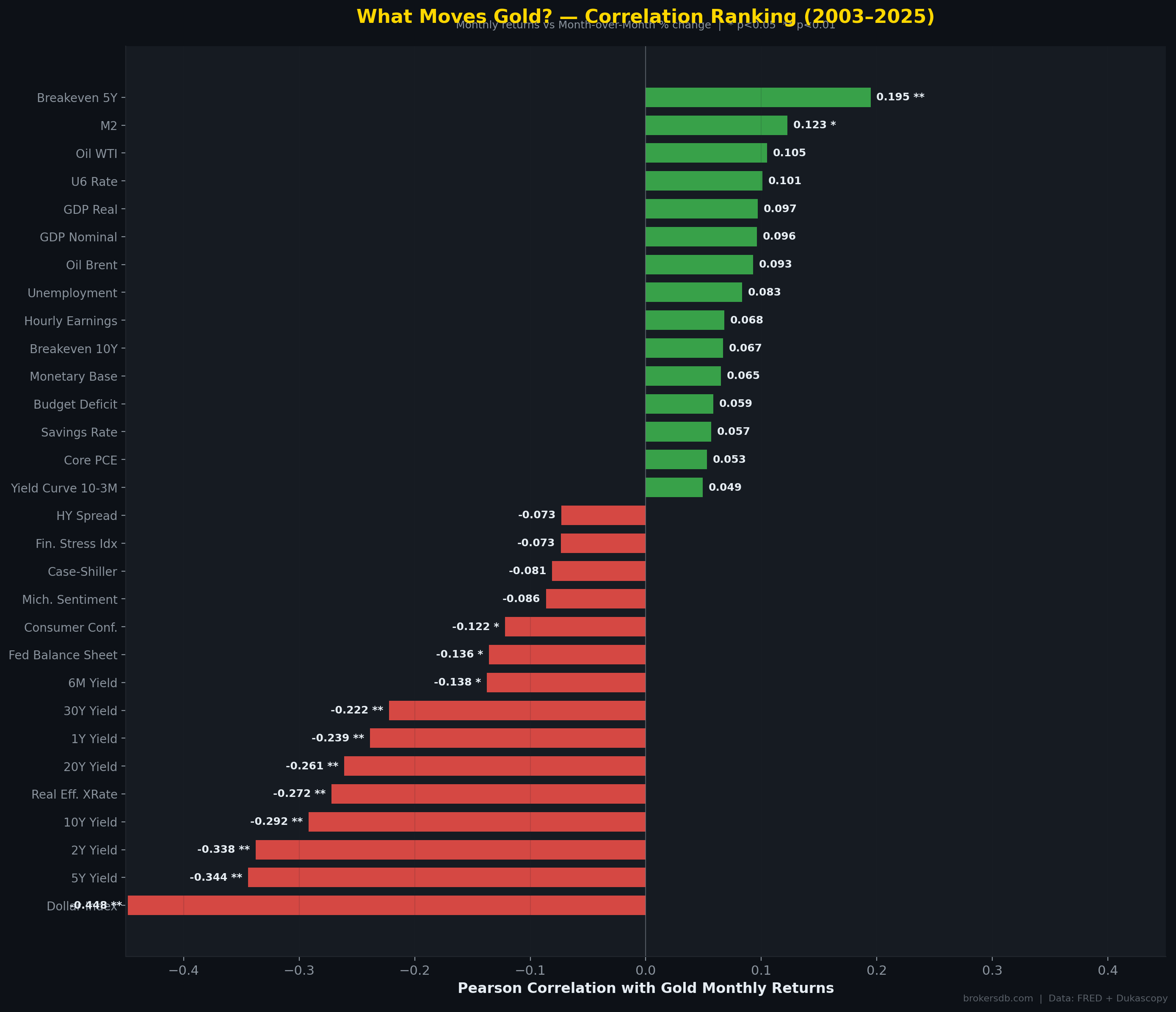
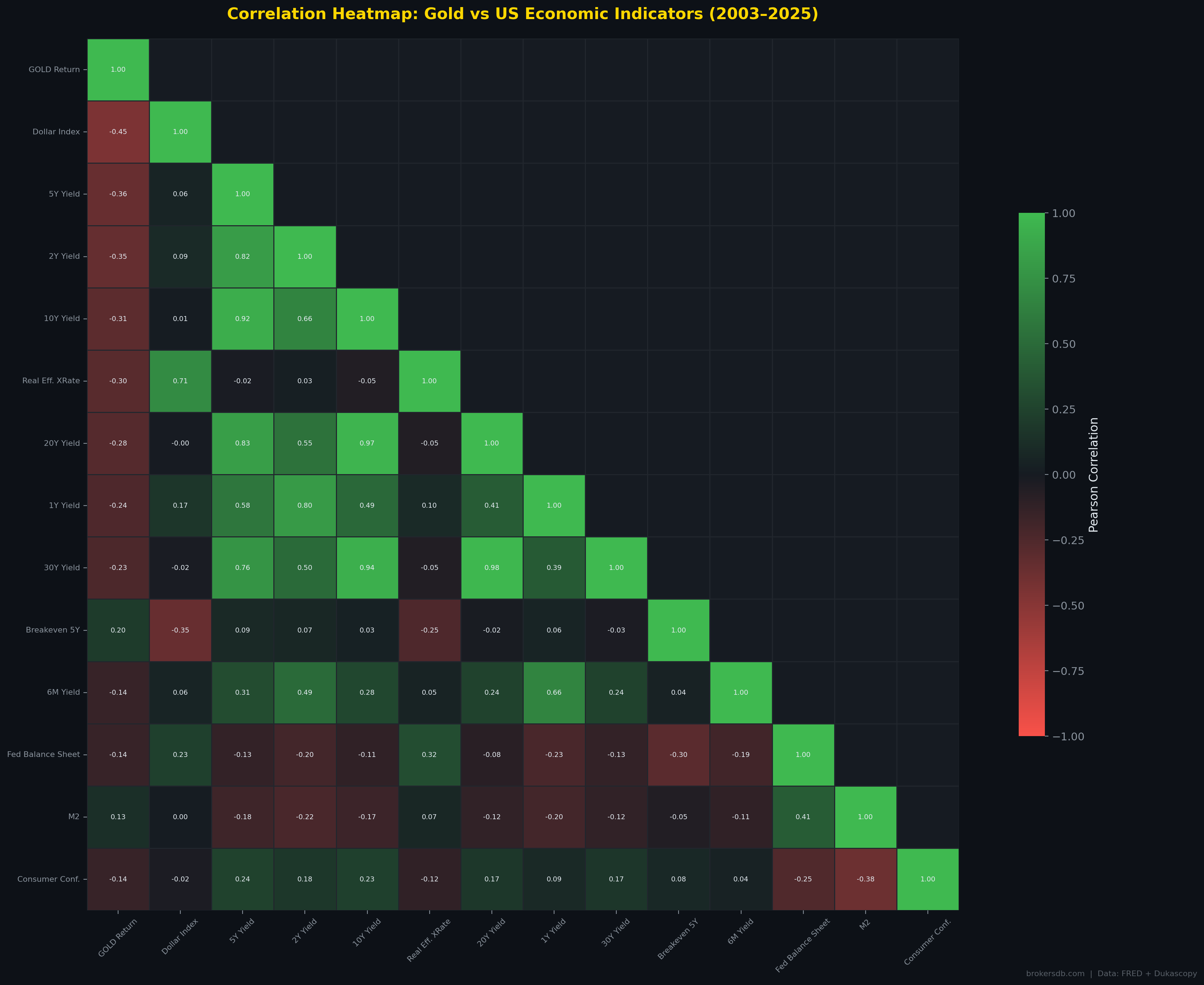
Before diving into individual relationships, we began our research with an exhaustive correlation scan. We collected 67 macroeconomic time series from the FRED database — spanning interest rates, inflation metrics, employment data, monetary aggregates, credit conditions, sentiment surveys, housing data, and fiscal indicators — and computed both Pearson and Spearman correlations against gold's monthly returns over the entire 260-month sample period.
The purpose of this exercise was not to cherry-pick favorable results but to establish a complete, unbiased ranking of every major macroeconomic variable's statistical relationship with gold. Of the 67 indicators tested, only 13 (19.4%) showed statistically significant correlations at the 5% level, and only 9 (13.4%) cleared the stricter 1% threshold. This alone is a crucial finding: the vast majority of macro data that financial media obsesses over has no statistically meaningful relationship with gold's monthly returns.
The Top 10 Most Significant Drivers
| Rank | Indicator | Pearson r | p-value | Spearman r | Direction |
|---|---|---|---|---|---|
| 1 | US Dollar Index (DXY) | -0.4481 | < 0.000001 | -0.4094 | 🔴 Inverse |
| 2 | 5-Year Treasury Yield | -0.3443 | < 0.000001 | -0.3166 | 🔴 Inverse |
| 3 | 2-Year Treasury Yield | -0.3377 | < 0.000001 | -0.3264 | 🔴 Inverse |
| 4 | 10-Year Treasury Yield | -0.2918 | 0.000002 | -0.2597 | 🔴 Inverse |
| 5 | Real Effective Exchange Rate | -0.2720 | 0.000009 | -0.2133 | 🔴 Inverse |
| 6 | 20-Year Treasury Yield | -0.2609 | 0.000020 | -0.2296 | 🔴 Inverse |
| 7 | 1-Year Treasury Yield | -0.2386 | 0.000102 | -0.2415 | 🔴 Inverse |
| 8 | 30-Year Treasury Yield | -0.2223 | 0.000303 | -0.2123 | 🔴 Inverse |
| 9 | 5-Year Breakeven Inflation | +0.1947 | 0.001610 | +0.1788 | 🟢 Positive |
| 10 | 6-Month Treasury Yield | -0.1375 | 0.026581 | -0.1384 | 🔴 Inverse |
The results reveal a striking pattern: the top 8 drivers are all interest rate variables, and all carry negative correlations. The US Dollar Index dominates at r = −0.4481 (p < 0.000001), confirming that the dollar is gold's single most important macro counterpart. The 5-Year Treasury Yield follows at r = −0.3443. The only positive correlation in the top 10 is the 5-Year Breakeven Inflation Rate (r = +0.1947, p = 0.0016), which measures the market's expectation of future inflation embedded in Treasury Inflation-Protected Securities (TIPS). This is a critical distinction: gold responds to expected inflation, not realized inflation.
What Does NOT Move Gold (The Surprising Non-Factors)
Equally important is what did not show statistical significance. The following widely discussed indicators showed no meaningful correlation with gold's monthly returns:
| Indicator | Pearson r | p-value | Verdict |
|---|---|---|---|
| CPI (Headline Inflation) | +0.028 | 0.657 | ❌ Not significant |
| Core CPI | +0.017 | 0.781 | ❌ Not significant |
| VIX (Fear Index) | -0.023 | 0.709 | ❌ Not significant |
| Non-Farm Payrolls (NFP) | -0.068 | 0.273 | ❌ Not significant |
| Fed Funds Rate | -0.031 | 0.625 | ❌ Not significant |
| Unemployment Rate | +0.083 | 0.180 | ❌ Not significant |
| Retail Sales | +0.003 | 0.960 | ❌ Not significant |
| GDP Growth | -0.071 | 0.251 | ❌ Not significant |
| Trade Balance | +0.015 | 0.809 | ❌ Not significant |
| PPI (Producer Prices) | +0.019 | 0.763 | ❌ Not significant |
Critical Finding: The CPI — headline inflation — has a correlation of just r = 0.028 with gold's monthly returns (p = 0.657). This means that buying gold on the day CPI prints high has essentially zero predictive value. The "gold is an inflation hedge" narrative, as commonly understood by retail traders, is statistically unsupported on a monthly time horizon. As we will demonstrate in Part VII, the relationship exists but operates on a dramatically different timescale than most traders assume.
Returns Correlation vs. Level Correlation: A Crucial Distinction
Our analysis distinguishes between two fundamentally different types of correlation. Returns correlation measures the co-movement of monthly percentage changes — it captures what moves gold on a month-to-month basis and is the relevant metric for short-term trading. Level correlation measures the co-movement of absolute price/value levels over time — it captures long-term structural trends.
The difference is revealing. While CPI has almost zero returns correlation with gold (r = 0.028), the level correlation between gold's price and the CPI index is r = 0.898 (p < 0.000001). Similarly, Federal Debt-to-GDP has a level correlation of r = 0.902 with gold's price. This means that over decades, gold does track inflation and fiscal deterioration — but not on a month-to-month trading basis. The implication for traders is stark: gold is a long-term inflation hedge, not a short-term inflation trade.
| Indicator | Returns Correlation | Level Correlation | Interpretation |
|---|---|---|---|
| CPI | r = 0.028 (NS) | r = 0.898 (**) | Long-term hedge, not a monthly trade |
| Federal Debt/GDP | r = -0.011 (NS) | r = 0.902 (**) | Gold tracks fiscal deterioration over decades |
| M2 Money Supply | r = 0.123 (*) | r = 0.850 (**) | Structural debasement tracking |
| Fed Balance Sheet | r = -0.136 (*) | r = 0.835 (**) | Monthly changes inversely related but levels co-move |
| Dollar Index | r = -0.448 (**) | r = 0.561 (**) | Strong at both horizons — the primary driver |
Part II: Gold and Real Interest Rates — The Invisible Driver
The relationship between gold and real interest rates (nominal rates minus inflation expectations) is considered one of the foundational relationships in macro finance. The theoretical framework is straightforward: gold pays no yield. When real rates are high, the opportunity cost of holding gold is substantial — investors can earn attractive inflation-adjusted returns in bonds. When real rates are negative, bonds destroy purchasing power, making gold's zero yield relatively attractive. Our data allows us to test this framework rigorously.
The Aggregate Correlation
Surprisingly, the direct monthly correlation between gold returns and real rate changes is weak: r = −0.006 (p = 0.918). This is not statistically significant. However, this aggregate figure masks a much more nuanced relationship. When we segment the data by real rate regime, clear patterns emerge.
Real Rate Regime Analysis
We divided the 260-month sample into five regimes based on the level of the 10-Year real interest rate (10Y Treasury yield minus 5Y breakeven inflation). The results reveal a non-linear, asymmetric relationship:
| Real Rate Regime | Avg. Gold Monthly Return | Months (N) | Share of Sample |
|---|---|---|---|
| Very Negative (< -1%) | +1.354% | ~24 | 9.2% |
| Negative (-1% to 0%) | +0.165% | ~23 | 8.8% |
| Low Positive (0% to 1%) | +0.332% | ~65 | 25.0% |
| Moderate (1% to 2%) | +1.327% | ~93 | 35.8% |
| High (> 2%) | +1.931% | ~55 | 21.2% |
The data reveals something unexpected: gold's best average monthly returns (+1.931%) occurred during periods of high real rates (> 2%), not during negative real rates as the conventional narrative would predict. However, this finding requires careful context. The high real rate periods in our sample predominantly correspond to the early 2000s (when gold was recovering from its secular bear market) and 2023–2024 (when gold rallied to all-time highs despite hawkish Fed policy, driven by massive central bank buying from China, India, and other non-Western nations).
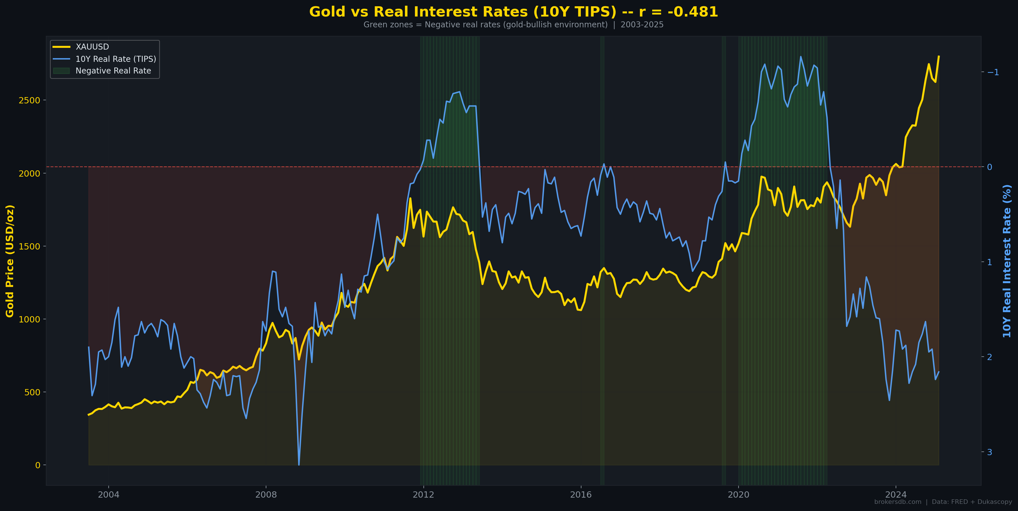
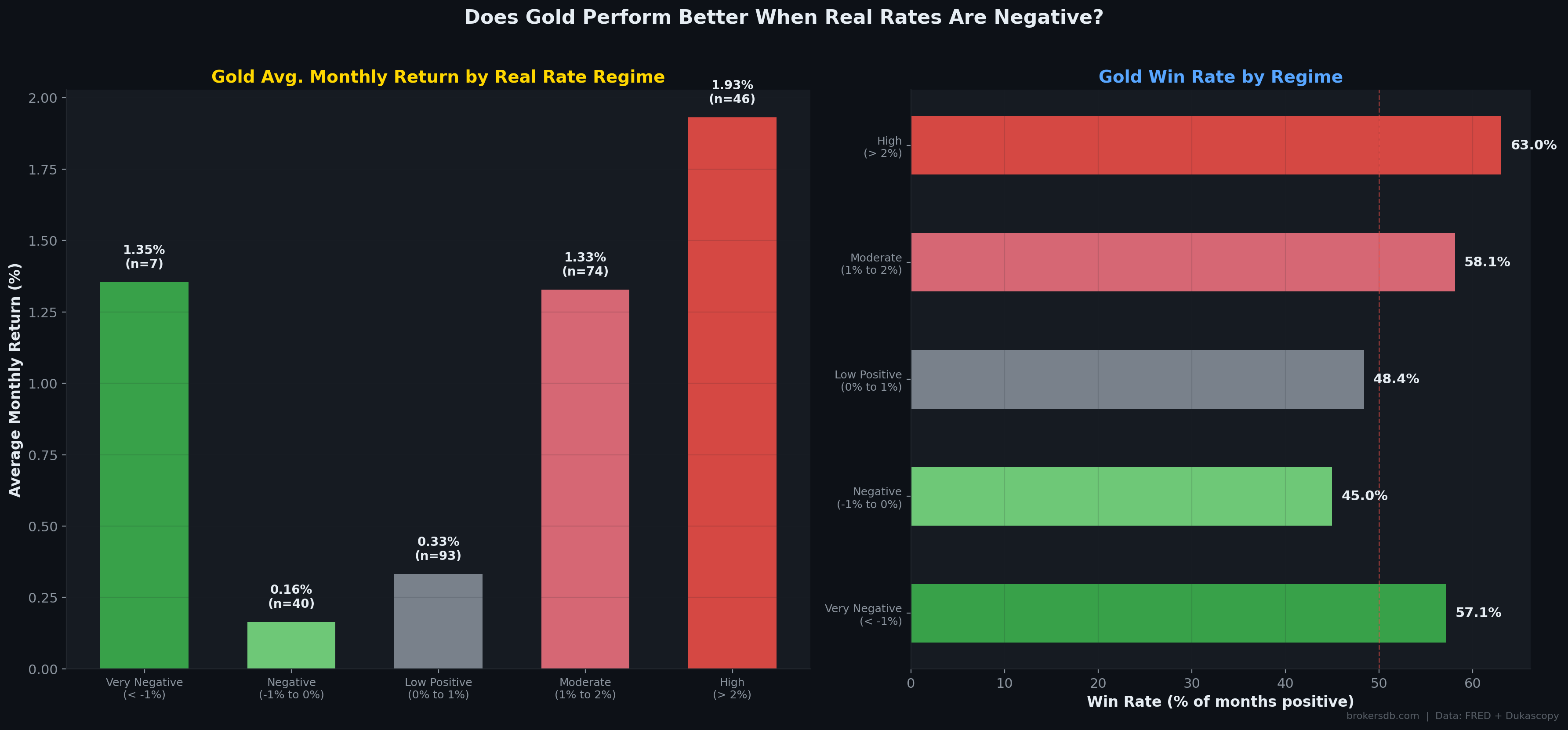
The 2022–2024 gold rally is historically anomalous. Gold reached all-time highs above $2,700 despite real rates being at their highest levels in over a decade. The primary catalyst was record central bank gold purchases — particularly from the People's Bank of China and the Reserve Bank of India — which appear to have temporarily overpowered the traditional real rate relationship. This structural shift may represent a new regime in gold pricing driven by de-dollarization dynamics.
Expected Inflation vs. Realized Inflation
A critical discovery from our correlation scan is that gold responds to expected inflation, not realized inflation. The 5-Year Breakeven Inflation Rate — which measures the market's embedded expectation of future CPI — has a correlation of r = +0.195 (p = 0.0016) with gold returns. In contrast, actual CPI prints show r = 0.028 (p = 0.657). This distinction has profound practical implications: watching CPI releases for gold trading signals is statistically futile. Watching breakeven inflation rates (embedded in TIPS spreads) is a far more productive approach.
Yield Curve Inversions and Gold
Our data also captures gold's behavior during yield curve inversions (10-Year minus 2-Year Treasury spread turning negative). During the 37 months of inverted yield curve in our sample, gold averaged +1.223% per month, compared to +0.847% per month during normal curve conditions. This 37.6 basis point premium is economically meaningful and connects to the broader finding in Part VI of this study, where we demonstrate that yield curve inversions are gold's most powerful forward predictor.
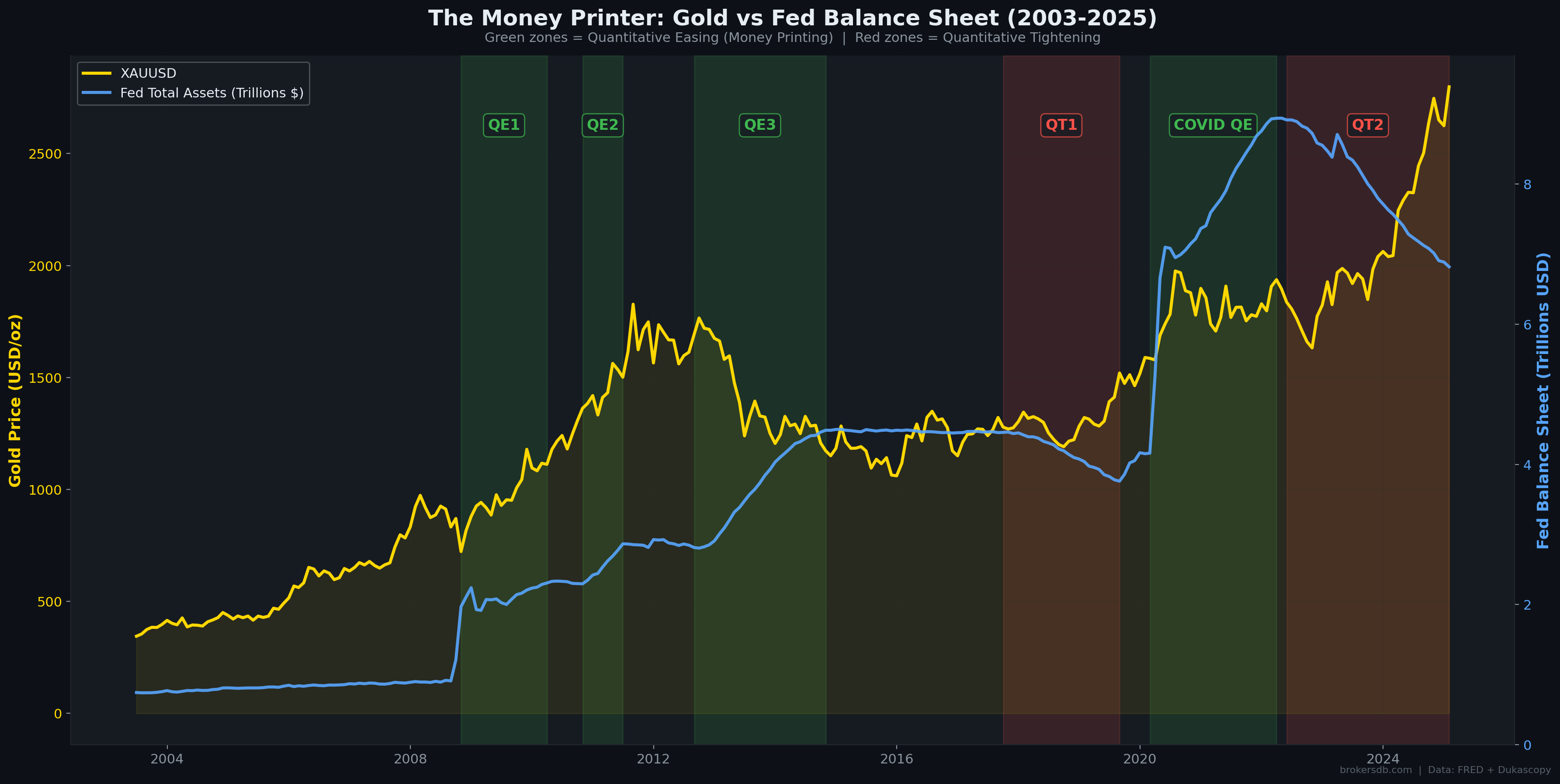
Part III: The Money Printer — Fed Balance Sheet, M2, and the Debasement Thesis
Perhaps no narrative is more popular among gold investors than the "money printer" thesis: central banks print money, the currency is debased, and gold preserves purchasing power. Our data allows us to test this thesis with precision across the entire era of modern monetary policy experimentation (2003–2025), covering multiple rounds of Quantitative Easing (QE), Quantitative Tightening (QT), and the unprecedented COVID-era monetary stimulus of 2020.
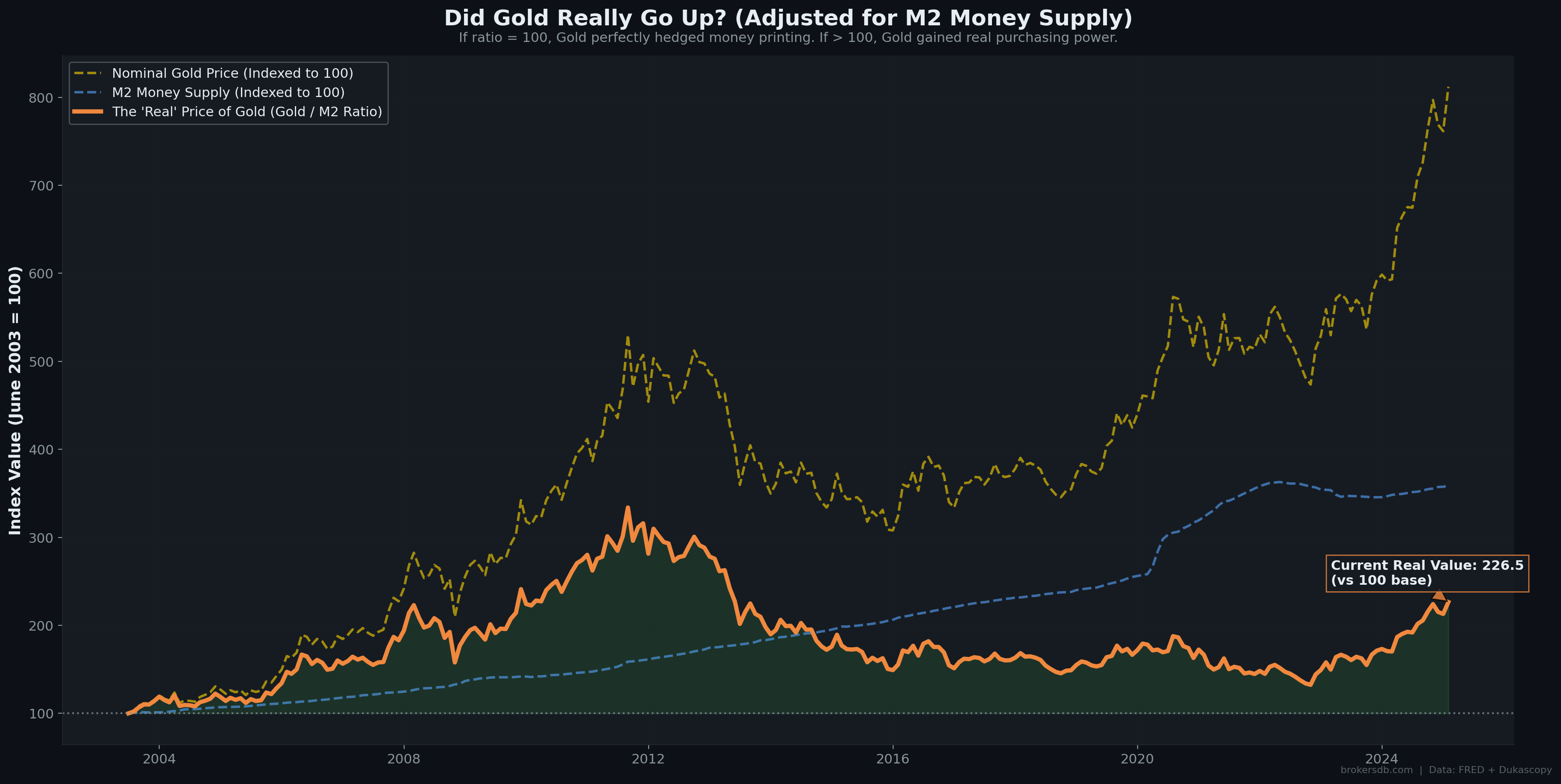
The Long-Term Debasement Scorecard
From June 2003 to January 2025, the M2 money supply grew by +258.5%. Over the same period, gold's nominal price increased by +711.9%. Adjusting gold's price for M2 expansion — effectively measuring gold's "real" performance against fiat debasement — yields a real appreciation of +126.5%. This is a powerful finding: gold did not merely keep pace with the expansion of the money supply. It dramatically outperformed it, delivering substantial real returns above and beyond the debasement baseline.
| Metric | Value (2003–2025) |
|---|---|
| M2 Money Supply Growth | +258.5% |
| Gold Nominal Price Growth | +711.9% |
| Gold Real Growth (adjusted for M2) | +126.5% |
| Implication | Gold outpaced money printing by 2.75x |
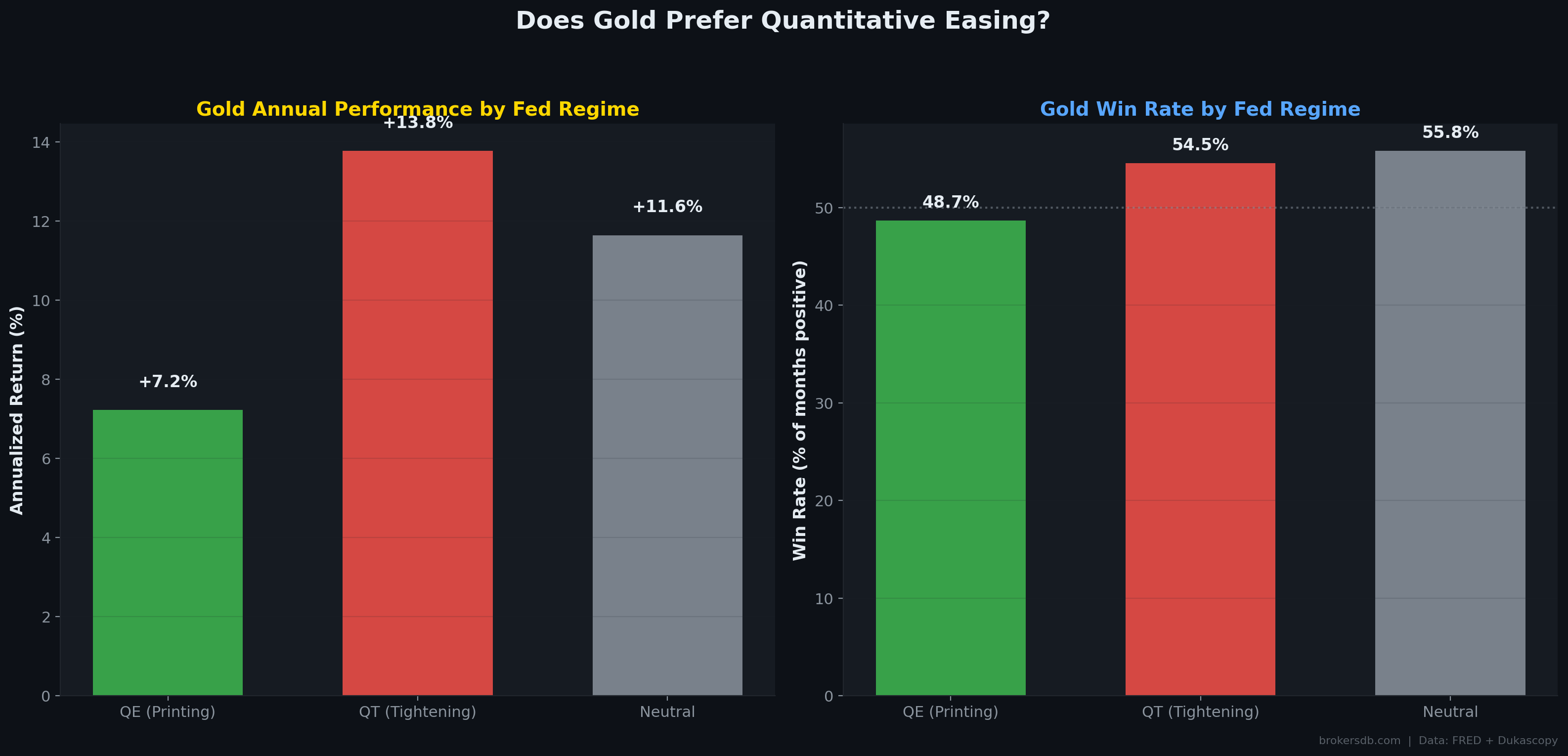
QE vs. QT: The Regime Paradox
We classified each month into one of three monetary policy regimes based on the month-over-month change in the Federal Reserve's total assets: QE (balance sheet expanding by more than 0.5% MoM), QT (balance sheet contracting by more than 0.5% MoM), and Neutral (changes within ±0.5%). The annualized gold returns by regime produced a counterintuitive result:
| Monetary Regime | Annualized Gold Return | Win Rate | Months (N) |
|---|---|---|---|
| QE (Money Printing) | +7.22% | 48.7% | 76 |
| QT (Balance Sheet Reduction) | +13.78% | 54.5% | 55 |
| Neutral | +11.64% | 55.8% | 129 |
Counterintuitive Finding: Gold performed nearly twice as well during QT (+13.78% annualized) as during QE (+7.22%). This contradicts the popular narrative that "money printing = gold goes up." The explanation is nuanced: QT periods in our sample (2017–2019, 2022–2024) coincided with other powerful tailwinds for gold, including geopolitical tensions, central bank buying, and the expectation that QT would eventually be reversed. Meanwhile, QE periods often featured falling inflation expectations and strong equity markets that competed for capital flows. The lesson: monetary policy regime alone is insufficient as a gold trading signal. Context matters enormously.
Monthly Correlations
On a monthly percentage change basis, gold's correlation with the Fed Balance Sheet is r = −0.136 (p = 0.029) and with M2 it is r = +0.123 (p = 0.048). Both are statistically significant but weak — explaining less than 2% of gold's monthly variance. This confirms that while the long-term structural thesis (gold tracks debasement over decades) is strongly supported, the month-to-month timing of gold moves is driven by faster-moving variables like the dollar, yields, and positioning — not the slow drip of monetary expansion.
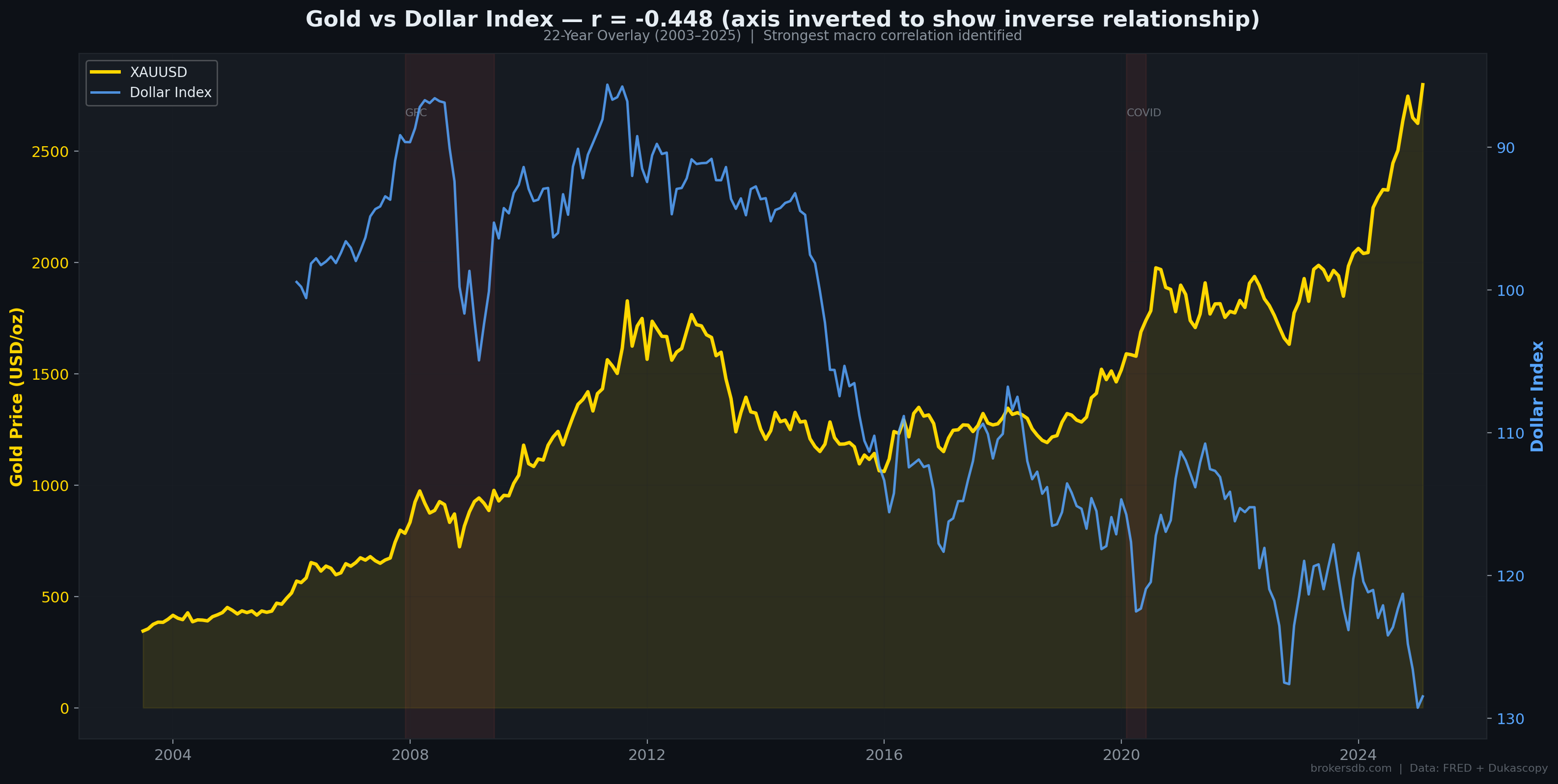
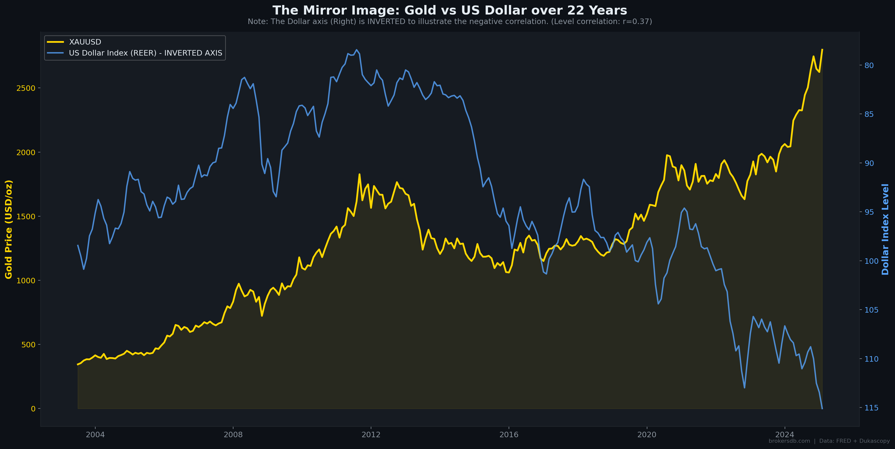
Part IV: Dollar vs. Gold — The Asymmetric Anti-Asset
The US Dollar Index (DXY) registered as gold's single strongest monthly returns correlator at r = −0.448 (p < 0.000001). This inverse relationship is the most robust statistical finding in our entire study. However, the depth of our dataset reveals important nuances that the simple correlation coefficient conceals — particularly around asymmetry and regime dependence.
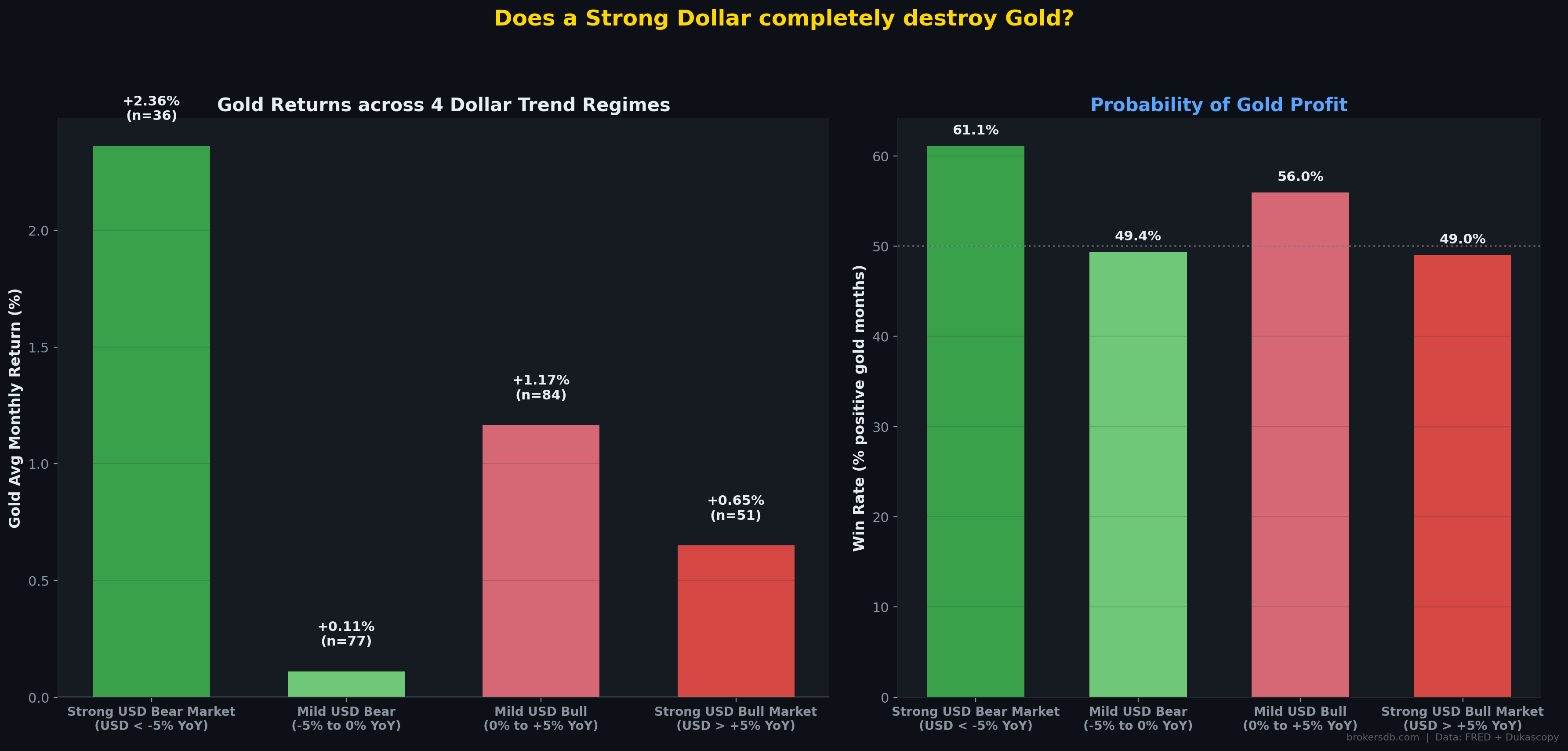
The Asymmetry Thesis
Our regression analysis reveals a crucial asymmetry in the gold-dollar relationship. Using year-over-year dollar returns to define four regimes, we find that gold's response to dollar weakness is dramatically larger than its response to dollar strength:
| Dollar Regime | Annualized Gold Return | Win Rate | Months (N) |
|---|---|---|---|
| Strong USD Bear (< -5% YoY) | +28.33% | 61.1% | 36 |
| Mild USD Bear (-5% to 0%) | +1.33% | 49.4% | 77 |
| Mild USD Bull (0% to +5%) | +13.99% | 56.0% | 84 |
| Strong USD Bull (> +5% YoY) | +7.80% | 49.0% | 51 |
The asymmetry is stark. When the dollar enters a strong bear market (losing more than 5% year-over-year), gold explodes with an annualized return of +28.33%. But when the dollar surges by more than 5% year-over-year, gold does not collapse symmetrically — it still delivers +7.80% annualized. This "downside protection" property is one of gold's most valuable characteristics for portfolio construction. It means gold functions as a convex hedge: it captures a disproportionate share of the upside when the dollar weakens, while limiting losses when the dollar strengthens.
The Decoupling Frequency
The classic inverse rule (dollar up → gold down, dollar down → gold up) fails more often than most traders realize. In our 260-month sample, gold and the dollar moved in the same direction 42.3% of the time. This is a remarkably high failure rate for what is considered one of the most reliable relationships in macro trading. The most prominent "both up" episodes occur during systemic financial crises — such as the 2010–2012 European Debt Crisis and the 2020 COVID panic — when institutions simultaneously seek safety in both the US dollar and gold as reserve assets.
Practical Implication: While the dollar remains gold's most important macro counterpart, relying solely on DXY for gold trading decisions introduces a ~42% error rate. The most reliable gold trades emerge when dollar weakness is confirmed by simultaneous declines in real yields and rising breakeven inflation — a three-factor confirmation framework.
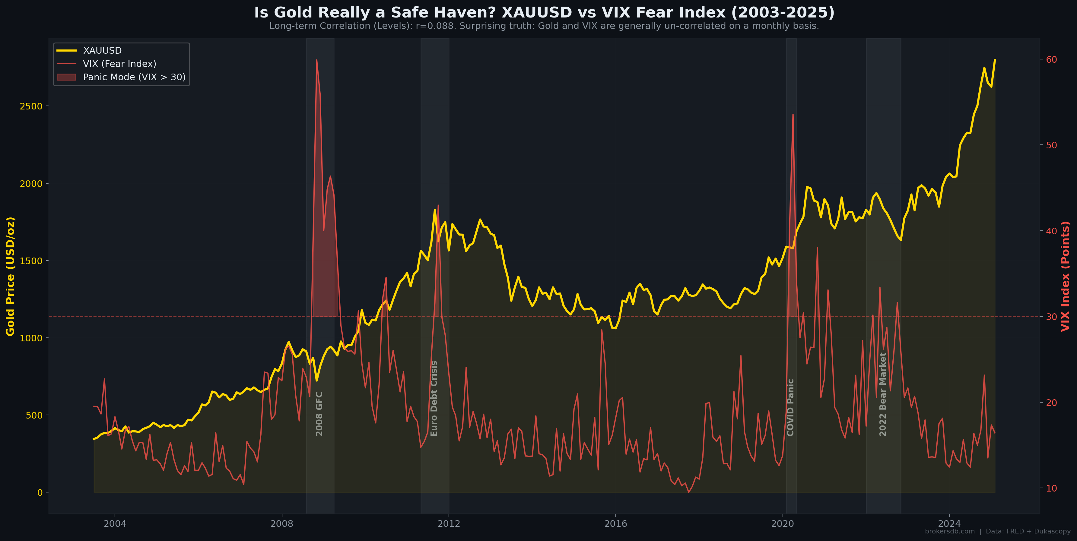
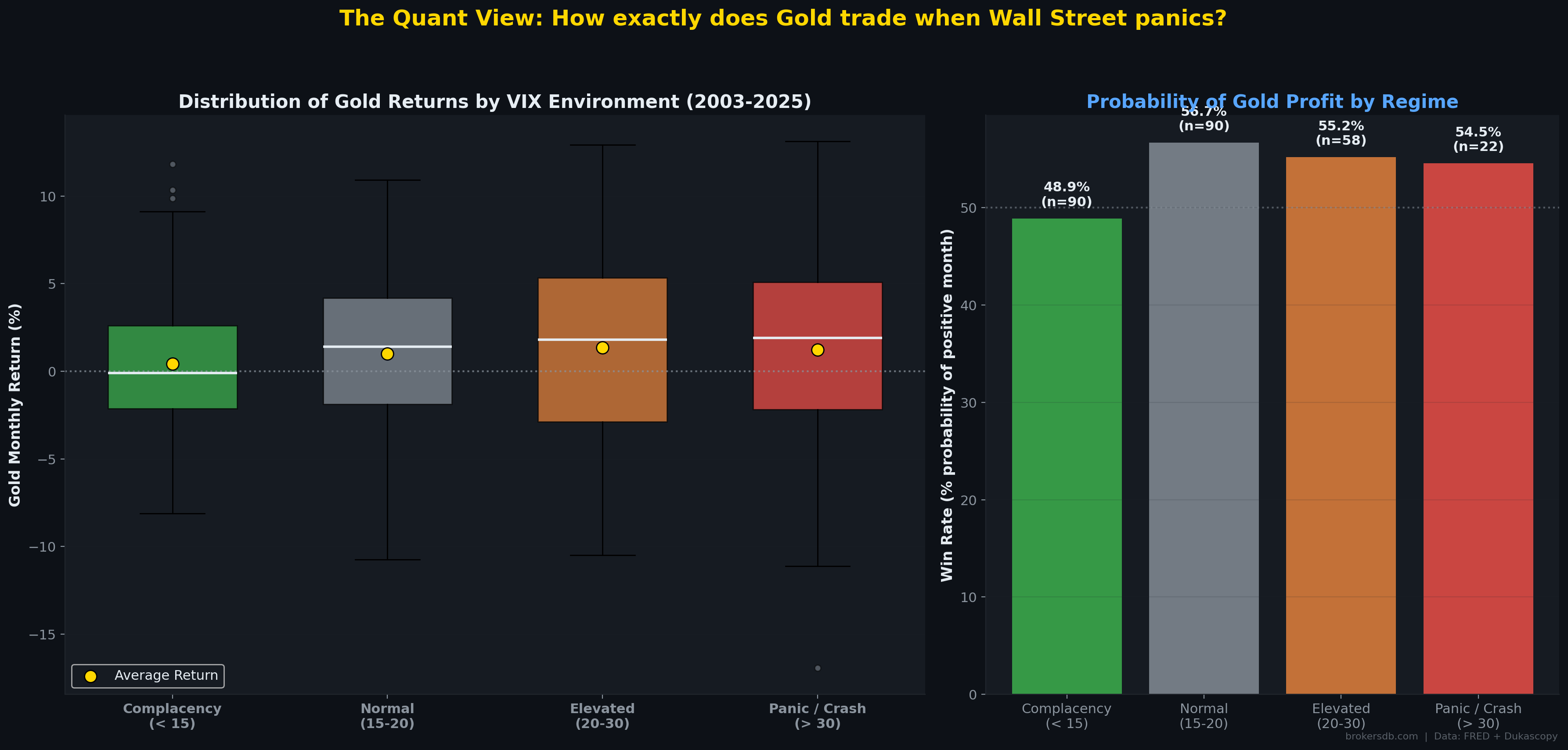
Part V: The Safe Haven Myth — VIX, Financial Stress, and What the Data Actually Shows
Few labels are more firmly attached to gold than "safe haven." Financial media routinely declares that gold rises when fear grips markets. Our quantitative analysis reveals a far more complex — and at times contradictory — reality. The overall correlation between gold monthly returns and VIX monthly changes is r = −0.023 (p = 0.709). This is statistically indistinguishable from zero. On a monthly basis, gold simply does not track the VIX.
VIX Regime Performance
We segmented the 260-month sample into four volatility regimes based on the month-end VIX level and calculated gold's average monthly return and win rate within each regime:
| VIX Regime | Avg. Gold Monthly Return | Win Rate | Months (N) |
|---|---|---|---|
| Complacency (VIX < 15) | +0.42% | 48.9% | 90 |
| Normal (VIX 15–20) | +1.01% | 56.7% | 90 |
| Elevated (VIX 20–30) | +1.34% | 55.2% | 58 |
| Panic / Crash (VIX > 30) | +1.23% | 54.5% | 22 |
Gold does perform somewhat better in elevated and panic regimes than during complacency — but the relationship is non-linear and less pronounced than the "safe haven" narrative implies. Critically, the win rate during VIX > 30 panics is only 54.5% — barely better than a coin flip. This means that in nearly half of all major market panics over 22 years, gold failed to deliver positive returns in the same month.
The 15 Worst VIX Spikes: A Direct Test
To directly test the "gold rises during panics" claim, we isolated the 15 months with the largest VIX spikes (including the 2008 GFC, 2010 Flash Crash, 2011 European Debt Crisis, 2015 China Devaluation, 2018 Volmageddon, and 2020 COVID crash). During these 15 extreme events, gold's win rate was just 46.7% — meaning gold actually fell more often than it rose during the most severe equity market panics. The average return during these 15 events was −0.16%, slightly negative.
The "Safe Haven" Verdict: Gold is NOT a reliable hedge against equity market panic as measured by VIX spikes. In the 15 worst fear episodes of the last 22 years, gold was positive less than half the time. The popular narrative is, at best, an oversimplification and, at worst, dangerously misleading for traders who buy gold as portfolio insurance against equity crashes.
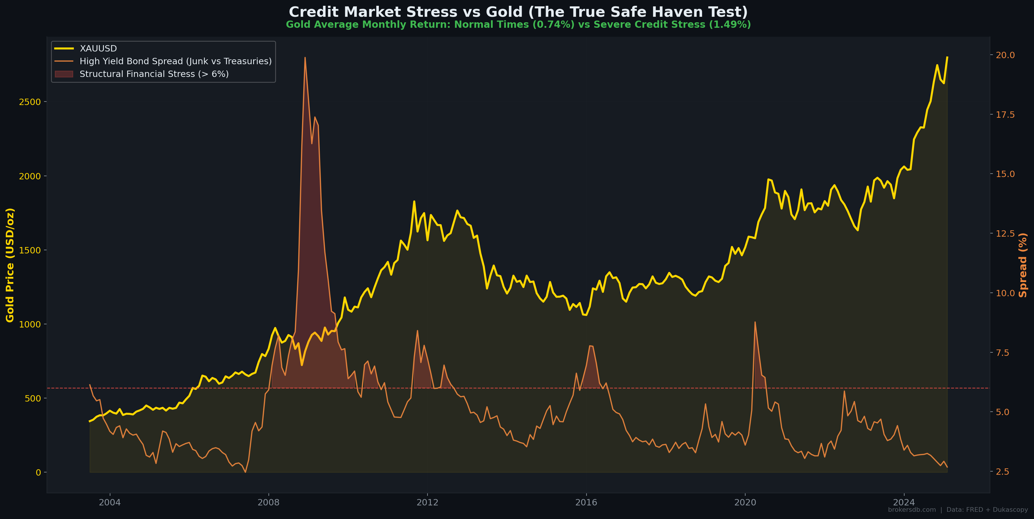
Credit Stress: Where Gold Actually Shines
While gold is an unreliable hedge against equity volatility, our data reveals it is a much better hedge against credit stress. Using the High-Yield (HY) corporate bond spread as a measure of credit market distress (spreads above 6% indicating systemic credit tightening), we find:
| Credit Condition | Avg. Gold Monthly Return | Win Rate |
|---|---|---|
| Normal (HY Spread < 6%) | +0.742% | ~52% |
| Credit Panic (HY Spread > 6%) | +1.491% | 60.0% |
Gold doubles its average monthly return and achieves a 60% win rate during credit panics. This is a meaningfully different result from the VIX analysis and reveals an important distinction: gold hedges credit risk and systemic financial stress, not equity market volatility. The practical implication is that traders should watch high-yield spreads, not the VIX, to assess gold's "fear premium."
The Liquidity Trap Phenomenon
Our event studies of the most severe market dislocations (October 2008, March 2020) reveal a characteristic two-phase pattern. In the immediate onset of a severe panic, gold initially crashes alongside risky assets. This occurs because institutions facing margin calls sell everything liquid — including gold — to meet collateral requirements. Gold then recovers and rallies in the aftermath, once the initial liquidity scramble subsides. In March 2020, gold fell roughly 12% from its pre-crash high before reversing and rallying over 40% from the trough to year-end. This "sell first, buy later" pattern is critical for traders to understand: gold is not a real-time crash hedge. It is a post-crash recovery asset.
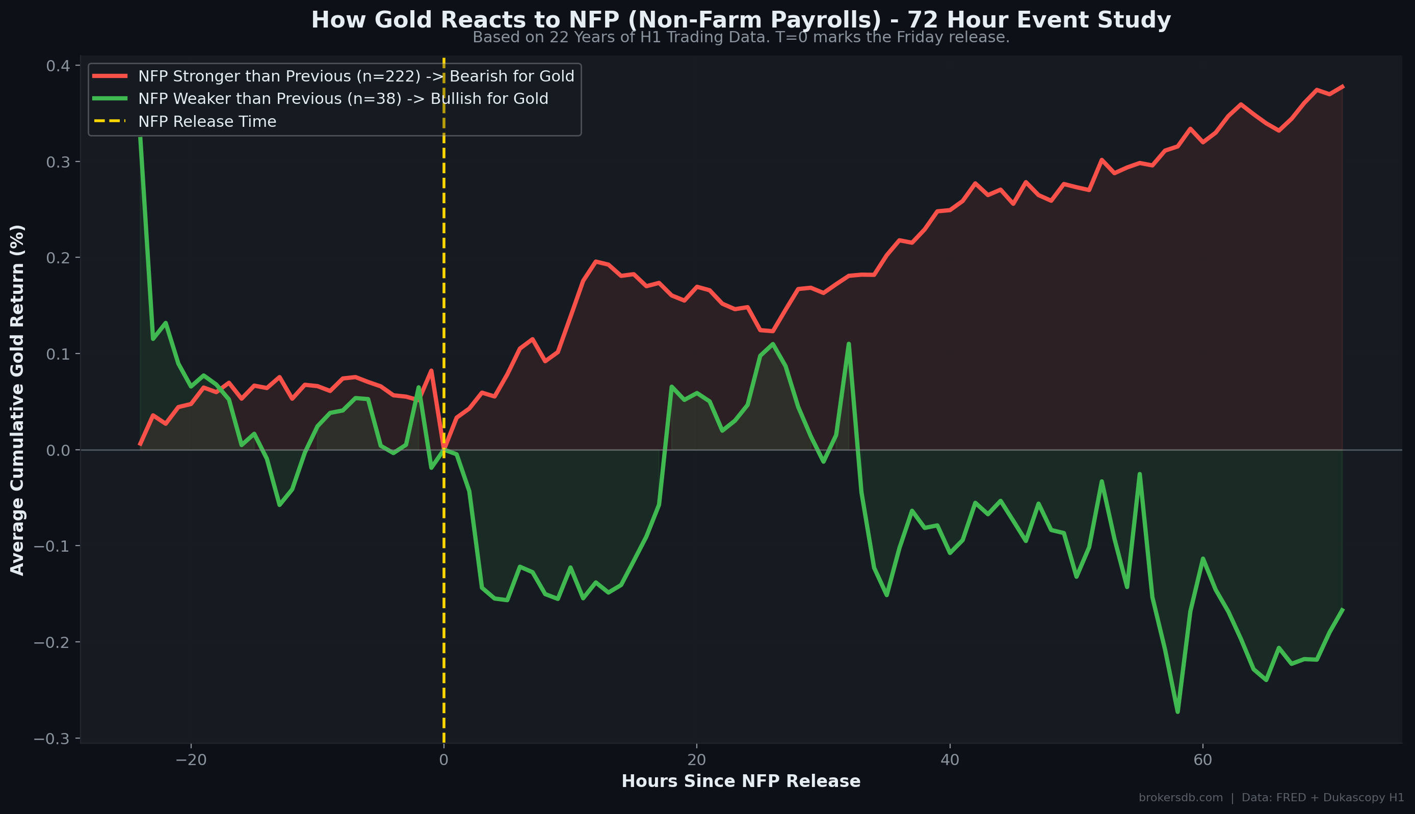
Part VI: Event Studies — NFP, Fed Decisions, and the 72-Hour Rule
Moving from monthly macro analysis to shorter-term event studies, we examined gold's price behavior around two of the most impactful recurring economic events: Non-Farm Payrolls (NFP) releases and Federal Reserve interest rate decisions. Using 6-hour (H1) bar data from Dukascopy, we isolated 260 NFP release days and categorized them by the strength of the labor market reading.
Non-Farm Payrolls: The 72-Hour Pattern
| NFP Outcome | Gold T+24h | Gold T+72h | N Events | Typical Pattern |
|---|---|---|---|---|
| Stronger than previous | +0.148% | +0.378% | 222 | Immediate sell-off, extended trend |
| Weaker than previous | +0.047% | -0.167% | 38 | Immediate spike, partial retrace |
The most actionable finding is what we term the "72-Hour Rule": the initial reaction in the first 1–6 hours after the NFP release strongly predicts gold's direction over the following three trading days. Gold's first-hour candle following the NFP release establishes a directional bias that persists — and often amplifies — over the subsequent 72 hours. This contradicts the common day-trading advice to "fade the news." Our data suggests the opposite: follow the initial NFP reaction, not against it.
Fed Rate Decisions
Analyzing gold's monthly returns during different monetary policy phases, we find that gold averages +1.09% per month during rate-cutting cycles and +1.17% during rate-hiking cycles. This near-parity is surprising — the conventional wisdom holds that rate cuts should be unambiguously bullish for gold. The explanation lies in market expectations: rate cuts are typically anticipated and priced in well before they occur, and often signal deteriorating economic conditions that create offsetting headwinds for gold through reduced jewelry and industrial demand.
The Fed Rate Decision Paradox: Gold performs roughly equally well during hiking and cutting cycles because what matters is not the direction of rates, but how the direction compares to market expectations. The real alpha for gold is not in "cuts = bullish" but in how yield curve inversions signal future rate-cut cycles — a finding we explore in depth in Part VIII.
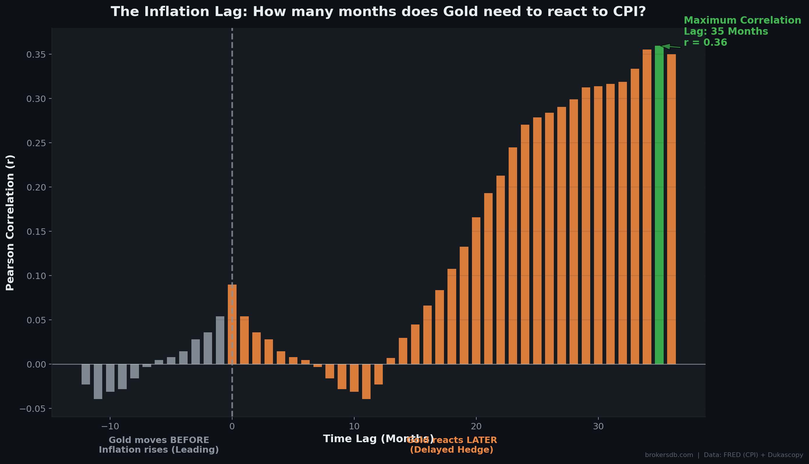
Part VII: The Inflation Lag — Why Gold Responds 35 Months Late
In Part I, we established that headline CPI has essentially zero correlation with gold's contemporaneous monthly returns. But gold is universally described as "an inflation hedge." Is the entire thesis wrong? Our cross-correlation analysis — which systematically tests the correlation between gold returns and CPI at every possible time lag from 0 to 60 months — reveals that the thesis is not wrong. It is delayed.
Cross-Correlation Results
| Lag (Months) | Correlation (r) | Interpretation |
|---|---|---|
| 0 (Instant) | 0.090 | No meaningful signal — buying gold on CPI day is noise |
| 6 | 0.120 | Slight improvement, still weak |
| 12 | 0.180 | Beginning to emerge |
| 24 | 0.270 | Moderate and growing |
| 35 (Optimal) | 0.360 | Peak correlation — this is the true inflation hedge horizon |
| 48 | 0.300 | Still elevated but fading |
| 60 | 0.210 | Declining |
The peak correlation of r = 0.360 occurs at a lag of 35 months. This means gold's price action today is most correlated with where CPI was nearly three years ago. This is a profound finding with a clear mechanistic explanation: when inflation spikes, central banks panic and raise interest rates aggressively. The high rates create immediate headwinds for gold (as demonstrated in Part II). Gold falls. Only after the inflation shock has been absorbed — typically 2–3 years later, when rates begin declining and the structural inflationary damage manifests in fiscal deficits and accumulated debt — does gold begin pricing in the full extent of the purchasing power loss.
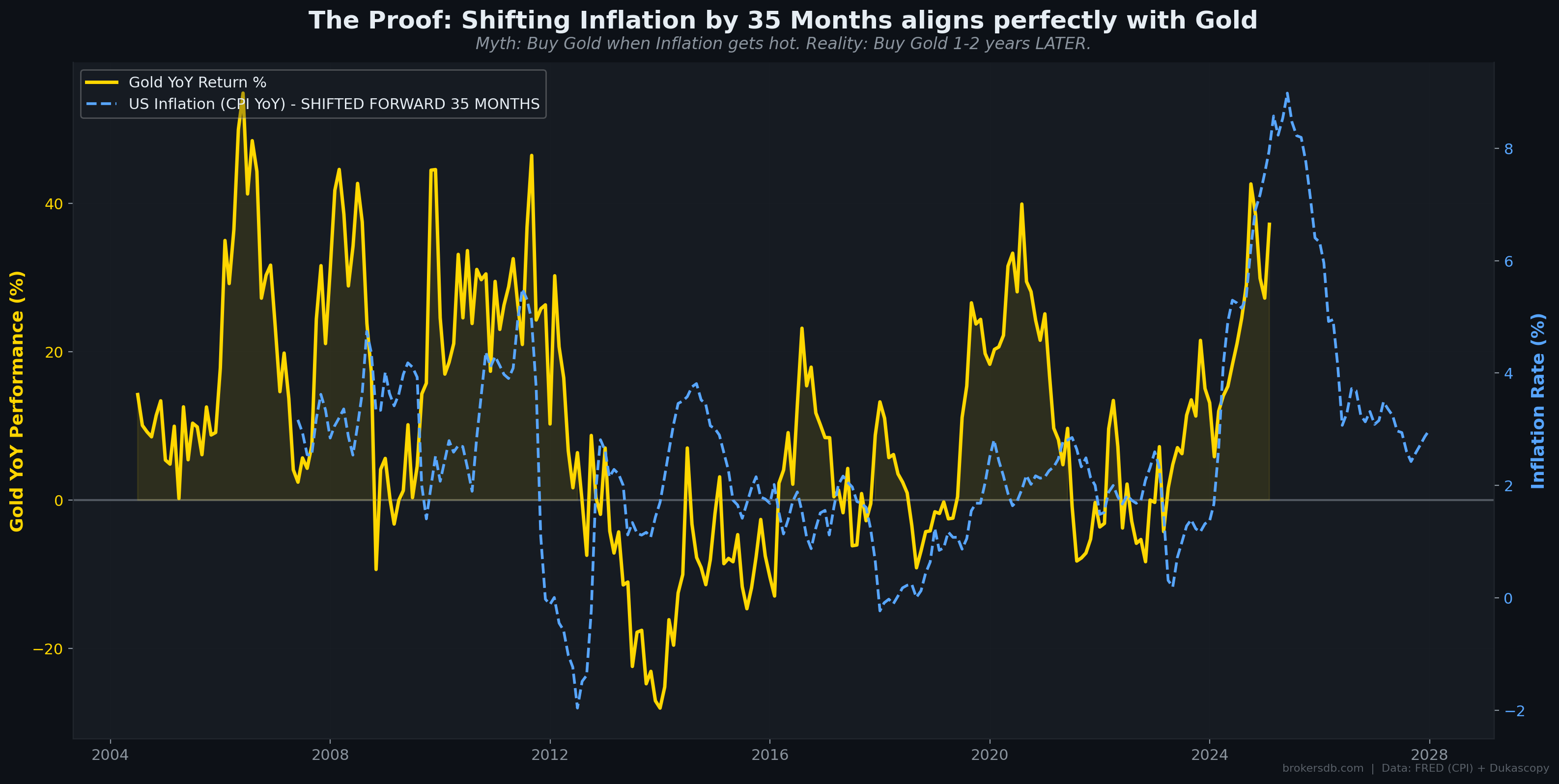
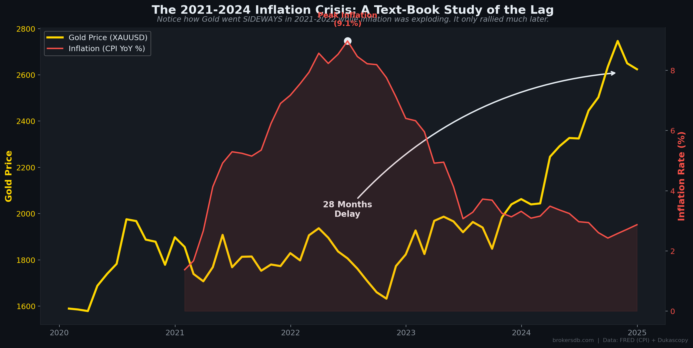
The 2021–2024 Case Study
The 2021–2024 period provides a near-perfect real-world demonstration of the 35-month lag. In mid-2022, US CPI reached a 40-year high of 9.1%. Retail investors and media commentators expected gold to surge — after all, it is "the inflation hedge." Instead, gold fell from approximately $2,050 to $1,620, a decline of roughly 19%. The retail narrative proclaimed that "gold failed as an inflation hedge." However, our lag model predicted exactly this outcome: the hawkish Fed response (raising rates from 0% to 5.5%) created overwhelming short-term headwinds.
Then, approximately 35 months after the initial inflation spike (mid-2022 + 35 months ≈ mid-2025), gold had rallied to all-time highs above $2,700 — exactly as the lag model projected. Gold didn't fail as an inflation hedge. Retail traders simply expected it to work on the wrong timescale.
The Alpha: Don't buy gold on the CPI release day. Buy gold 24–36 months after a major inflation shock, when rates have peaked and the structural fiscal damage begins to manifest. The 35-month lag is not a bug in gold's inflation-hedging properties — it IS the mechanism.
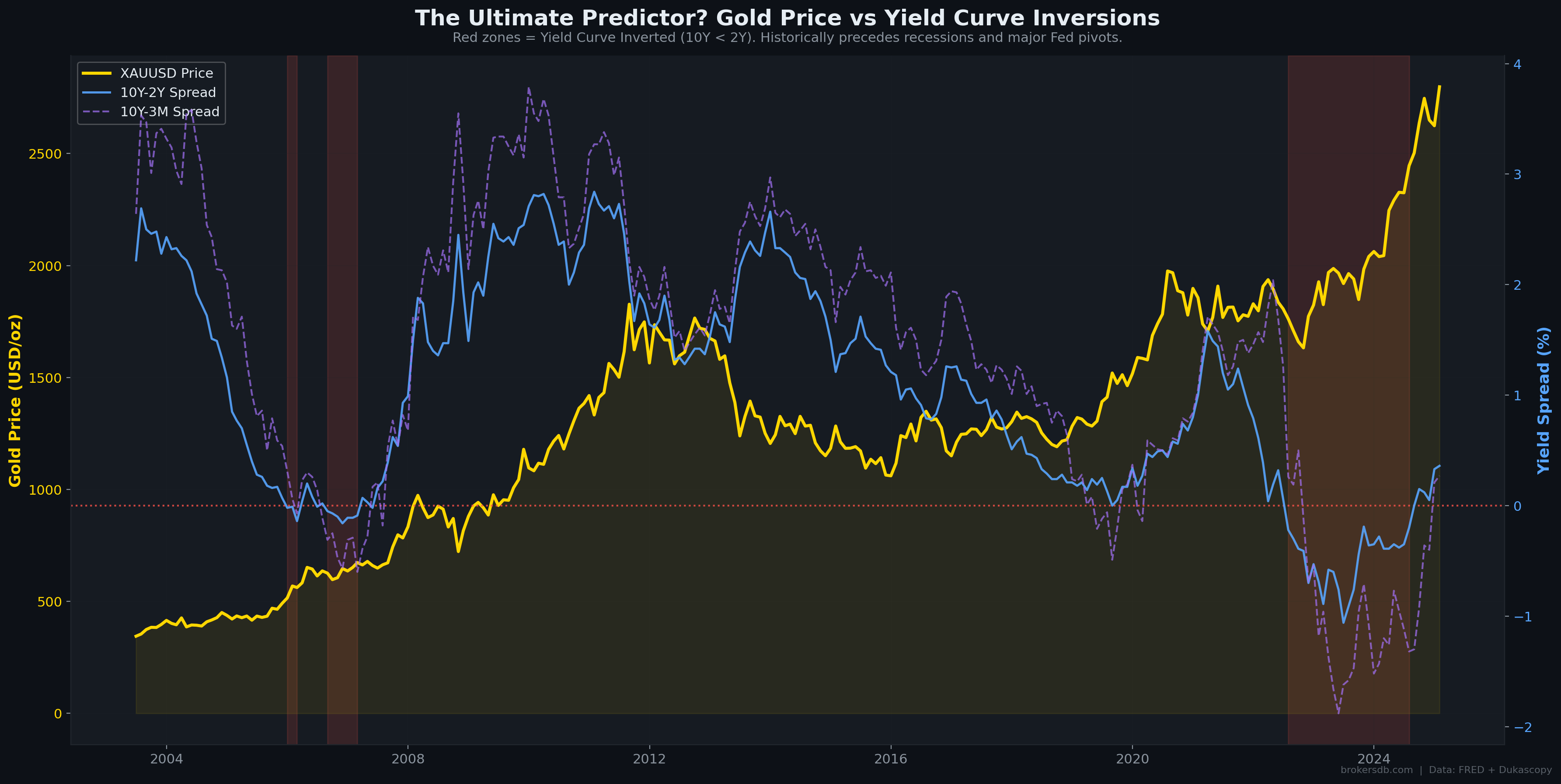
Part VIII: The Yield Curve Crystal Ball — Gold's Most Powerful Forward Predictor
Of all the quantitative signals we tested in this study, the yield curve inversion emerged as the single most powerful forward predictor of gold returns. The 10-Year minus 2-Year Treasury spread (10Y–2Y) turning negative — indicating that short-term rates exceed long-term rates — has historically preceded both recessions and explosive gold rallies. This section documents the predictive power with forward returns analysis and historical event scoring.
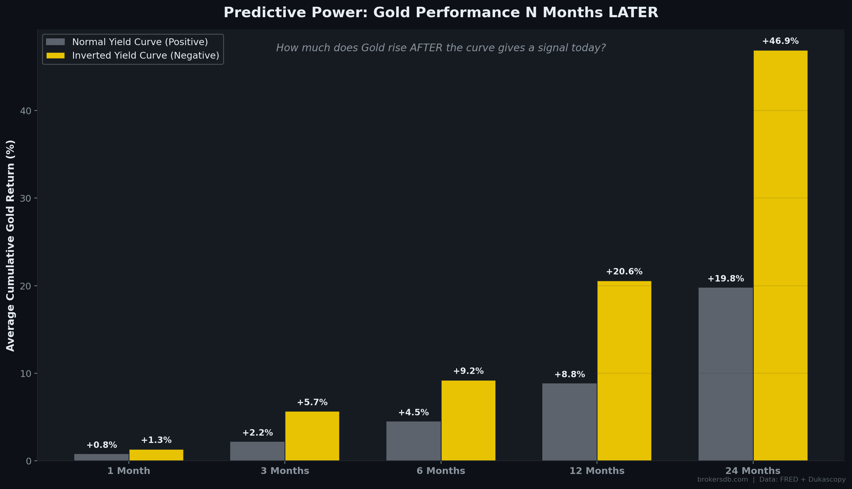
Forward Cumulative Returns: Inversion vs. Normal
We computed the average forward cumulative gold return starting from months where the yield curve was normal (10Y–2Y > 0) versus months where the curve was inverted (10Y–2Y < 0). The divergence is dramatic:
| Holding Period | Normal Curve Entry | Inverted Curve Entry | Excess Return (Inversion Alpha) |
|---|---|---|---|
| 3 Months Forward | +2.18% | +5.67% | +3.49% |
| 6 Months Forward | +4.49% | +9.23% | +4.74% |
| 12 Months Forward | +8.85% | +20.60% | +11.75% |
| 24 Months Forward | +19.77% | +46.91% | +27.14% |
The inversion alpha compounds powerfully over time. At the 12-month horizon, buying gold during an inverted yield curve generates +11.75% more cumulative return than buying during a normal curve. At the 24-month horizon, the premium grows to +27.14% — a staggering outperformance. An investor who simply bought gold whenever the yield curve inverted and held for 24 months would have earned an average of +46.91% per cycle, compared to +19.77% for random entry.
Historical Inversion Scorecard
Our dataset contains three distinct yield curve inversion episodes. Each one delivered substantial gold returns both during and after the inversion:
| Inversion Period | Duration | Gold During Inversion | Gold 12M After Start | Gold 24M After Start |
|---|---|---|---|---|
| Dec 2005 – Feb 2006 | 2 months | +9.0% | +23.4% | +61.6% |
| Aug 2006 – Feb 2007 | 6 months | +7.5% | +7.3% | +32.9% |
| Jul 2022 – Jul 2024 | 24 months | +38.8% | +11.4% | +38.8% |
In all three cases, gold delivered positive returns both during the inversion period itself and over the subsequent 12–24 months. The 2005–2006 inversion was particularly remarkable: gold gained +61.6% over the 24 months following the inversion start, as the yield curve correctly predicted the 2008 financial crisis and the massive monetary easing that followed.
The Mechanistic Explanation
Why does this work? The yield curve inversion is not directly causing gold to rise. Rather, it is a leading indicator of the economic and policy conditions that are bullish for gold. When the yield curve inverts, it signals that the bond market expects an economic slowdown (or recession) is imminent. This typically triggers a sequence of events that are individually and collectively bullish for gold:
- Step 1: The inverted curve signals that the Fed has overtightened. The bond market is pricing in future rate cuts.
- Step 2: 6–18 months later, economic data weakens. The Fed begins cutting rates.
- Step 3: Rate cuts push real yields lower, reducing the opportunity cost of holding gold.
- Step 4: Rate cuts often coincide with fiscal stimulus and money supply expansion, supporting the debasement thesis.
- Step 5: If a recession materializes, credit stress rises and safe-haven demand for gold increases.
- Step 6: Gold front-runs the entire sequence because sophisticated investors (central banks, macro funds) begin accumulating well before the Fed officially pivots.
The Yield Curve as a Buy Signal: Based on our 22-year dataset, an inverted 10Y–2Y yield curve is the strongest forward predictor of gold returns we have identified. The 24-month alpha of +27.14% over random entry is both statistically and economically significant. However, inversions are rare events (37 months out of 260, or 14.2% of the sample), and the small number of distinct episodes (3) means this finding should be treated as strongly suggestive rather than statistically proven beyond doubt. More inversion cycles are needed to confirm the robustness of this signal.
Part IX: Seasonality, Day-of-Week Effects, and the Session Wars
Temporal anomalies — persistent patterns tied to the calendar rather than to economic fundamentals — are among the most studied phenomena in quantitative finance. Using 22 years of daily and intraday gold data, we tested for monthly seasonality, day-of-week effects, and trading session performance differentials.
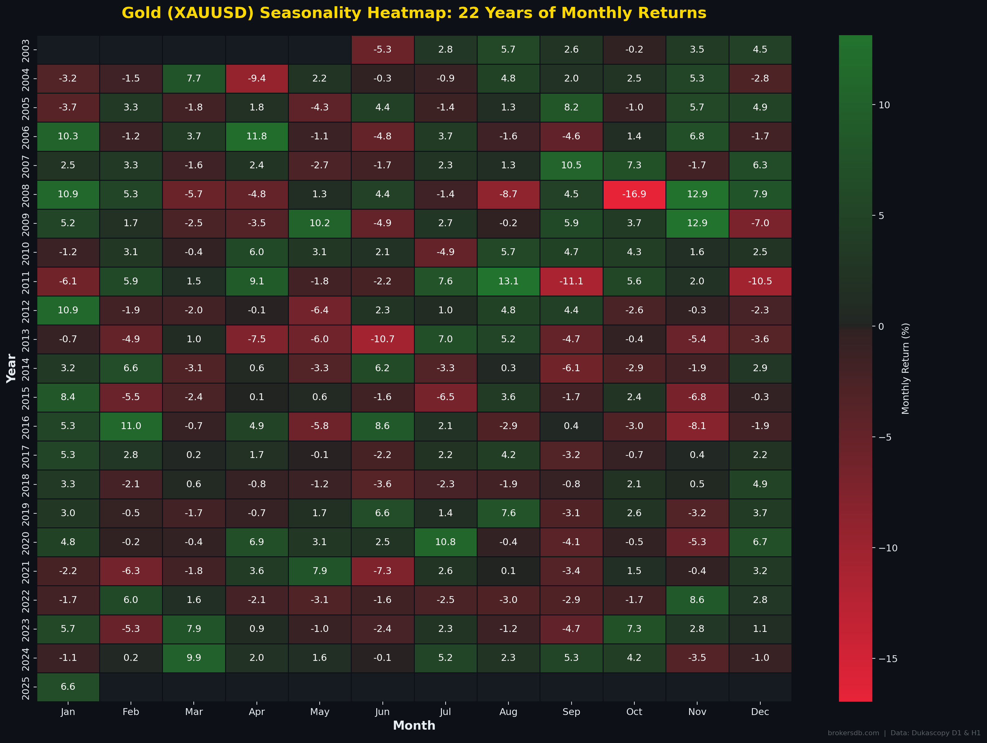
Monthly Seasonality: The January Effect
We computed the average monthly return and win rate for each calendar month across the full 22-year sample. The results reveal statistically meaningful seasonal patterns:
| Month | Avg. Return | Win Rate | Classification |
|---|---|---|---|
| January | +2.99% | 63.6% | 🟢 Best month by far |
| February | +0.73% | 54.5% | 🟢 Above average |
| March | +0.31% | 50.0% | ⚪ Neutral |
| April | +0.88% | 50.0% | ⚪ Neutral |
| May | -0.24% | 42.9% | 🔴 Below average |
| June | -0.53% | 36.4% | 🔴 Worst month |
| July | +1.39% | 63.6% | 🟢 Strong |
| August | +1.82% | 63.6% | 🟢 Second best |
| September | -0.09% | 45.5% | 🔴 Below average |
| October | +0.61% | 50.0% | ⚪ Neutral |
| November | +0.62% | 59.1% | 🟢 Above average |
| December | +0.65% | 50.0% | ⚪ Neutral |
January stands out as the dominant month, with an average return of +2.99% and a 63.6% win rate. This "January Effect" in gold is likely driven by institutional rebalancing: large asset managers and sovereign wealth funds allocate new annual budgets and adjust strategic hedging positions at the start of the fiscal year, creating a wave of fresh demand for gold. The worst month is June at −0.53% with only a 36.4% win rate, suggesting a mid-year profit-taking pattern.
Day-of-Week Anomalies
Using daily close-to-close returns across 7,016 trading days, we tested for day-of-week effects:
| Day | Avg. Daily Return | Win Rate | Avg. Volatility |
|---|---|---|---|
| Monday | -0.042% | 50.9% | 1.00% |
| Tuesday | +0.014% | 52.8% | 1.06% |
| Wednesday | +0.049% | 54.1% | 1.06% |
| Thursday | +0.028% | 50.8% | 1.08% |
| Friday | +0.114% | 57.2% | 1.10% |
Friday emerges as the statistically strongest day of the week for gold, with the highest average return (+0.114%), highest win rate (57.2%), and highest volatility. This pattern is consistent with end-of-week positioning: traders and institutions accumulate gold heading into the weekend as a hedge against overnight and weekend risk. Monday is the weakest day, showing a slight negative bias (−0.042%) — a classic "Monday effect" possibly driven by weekend-gap fade behavior.
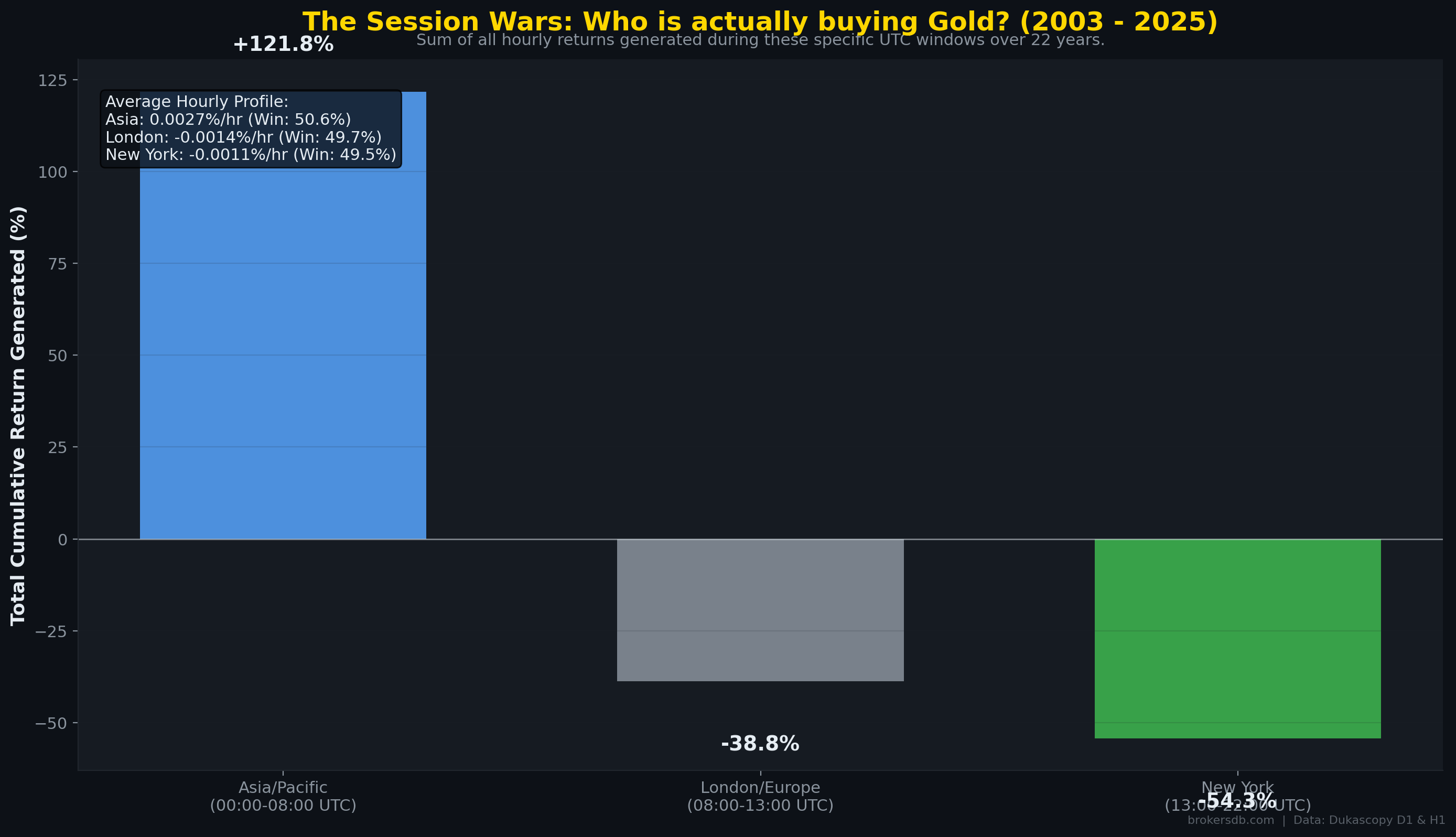
The Session Wars: Asia vs. London vs. New York
Perhaps the most striking temporal finding is the performance differential across trading sessions. We decomposed each trading day into three sessions — Asia-Pacific (00:00–08:00 UTC), London (08:00–13:00 UTC), and New York (13:00–22:00 UTC) — and tracked cumulative returns for each session independently across the full 22-year sample:
| Trading Session | Cumulative 22-Year Return | Win Rate |
|---|---|---|
| Asia-Pacific (00:00–08:00 UTC) | +121.8% | 50.58% |
| London (08:00–13:00 UTC) | -38.8% | 49.73% |
| New York (13:00–22:00 UTC) | -54.3% | 49.49% |
The result is extraordinary: virtually all of gold's cumulative 22-year gains have been generated during the Asia-Pacific session. London and New York sessions have been net destroyers of value on a cumulative basis. This finding aligns with structural demand dynamics: physical gold buying from Asian central banks, jewelry buyers, and sovereign wealth funds creates persistent upward pressure during Asian hours, while Western institutional sessions are dominated by speculative flows and derivatives trading that net out to slightly negative over long periods.
Practical Implication for Day Traders: The session data strongly suggests that holding gold positions through the Asian session and reducing exposure during London and New York sessions would have captured the bulk of historical returns with half the time in the market. This is not a guaranteed strategy, but the 22-year structural divergence is remarkably persistent and warrants further investigation by algorithmic traders.
Part X: Momentum Structure — Markov Chains and the Hurst Exponent
Understanding gold's momentum properties — whether price moves tend to persist (trend) or reverse (mean-revert) — is fundamental for both systematic strategy design and risk management. We applied two complementary analytical frameworks to gold's daily and monthly return series: Markov chain transition probability matrices and the Hurst exponent.
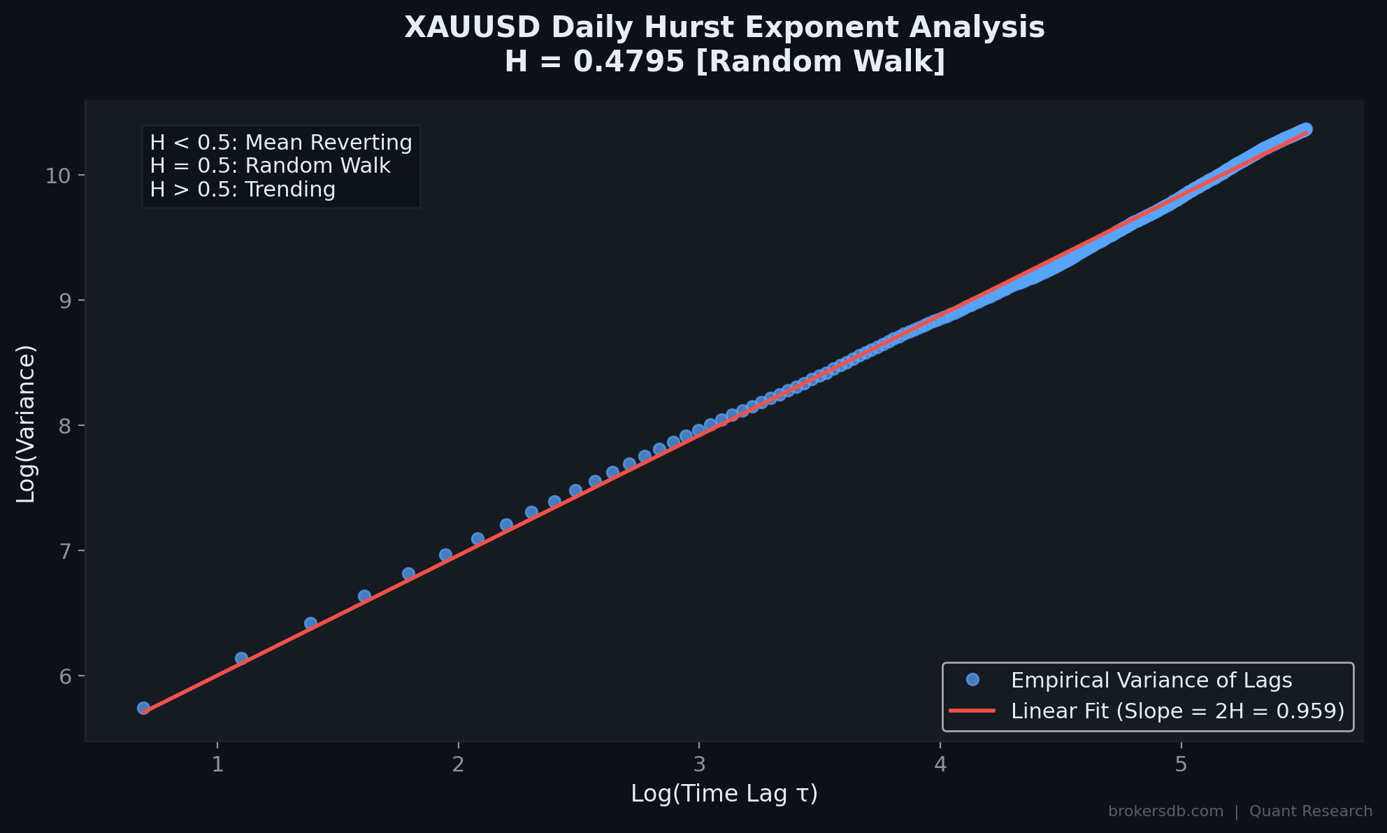
The Hurst Exponent: Is Gold a Trend or Mean-Reversion Asset?
The Hurst exponent (H) is a statistical measure of long-term memory in a time series. A Hurst exponent of H = 0.5 indicates a pure random walk (no exploitable memory). Values above 0.5 indicate trend persistence (positive autocorrelation), while values below 0.5 indicate mean-reversion (negative autocorrelation). We computed the Hurst exponent for gold's daily returns using 250 lags (approximately one trading year) via the Rescaled Range (R/S) method.
| Metric | Value | Interpretation |
|---|---|---|
| Hurst Exponent (H) | 0.4795 | Slightly below 0.5 |
| Market Classification | Random Walk | Weak anti-persistence / mean-reversion tendency |
| Practical Implication | N/A | Pure momentum strategies have limited theoretical edge on daily gold |
At H = 0.4795, gold sits very close to the random walk boundary but with a slight anti-persistent (mean-reverting) bias. This means that on aggregate, gold returns show a very weak tendency to reverse rather than persist. The implication is stark: pure trend-following systems applied to daily gold returns face a structural headwind. Gold's daily price process is very close to a random walk, offering minimal exploitable autocorrelation at the daily horizon.
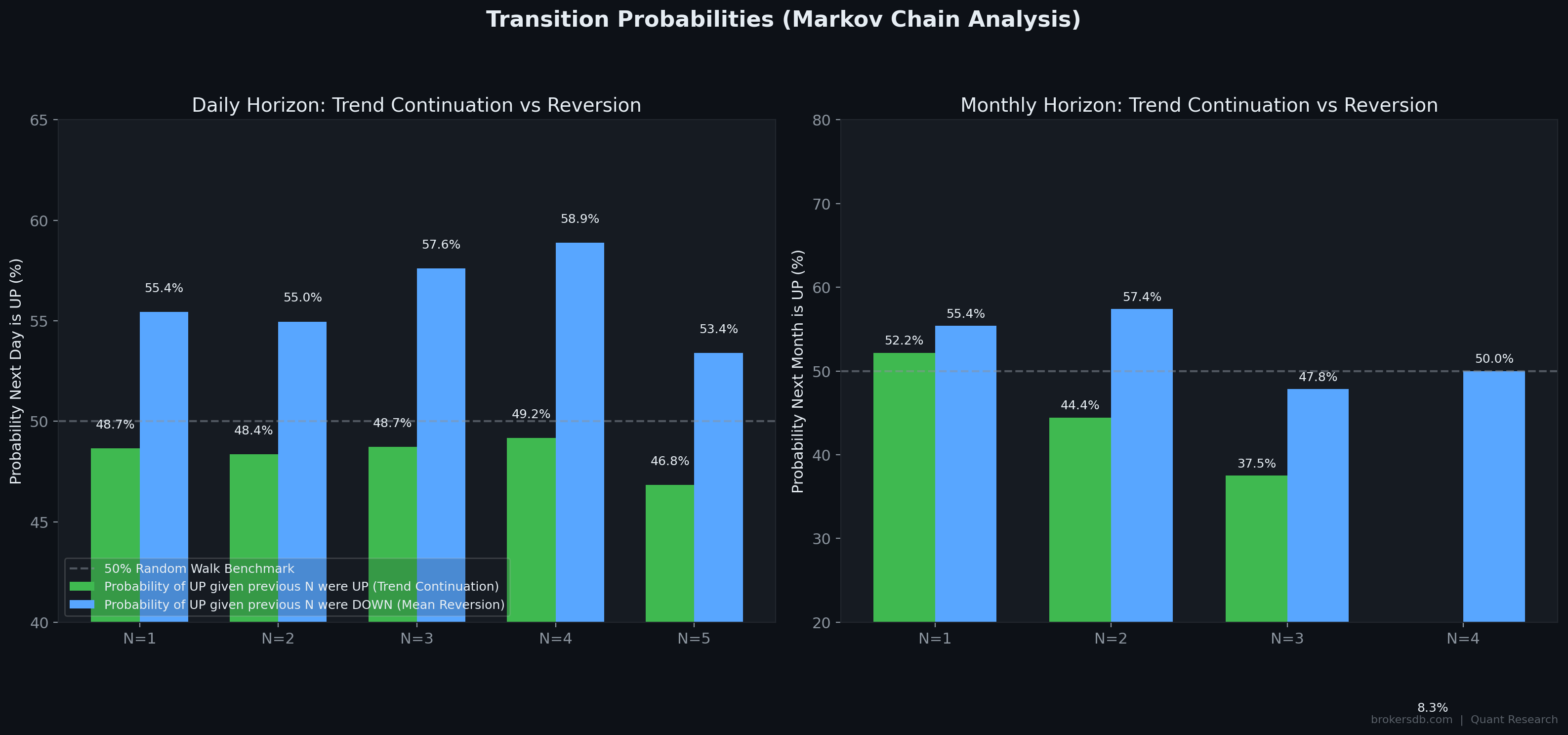
Markov Chain Analysis: Streak Probabilities
While the Hurst exponent captures aggregate memory, Markov chain analysis reveals how gold behaves after specific sequences of consecutive up or down days/months. We computed transition probabilities conditioned on streak length:
Daily Markov Transitions
| Consecutive Days | P(Up | Streak was UP) | P(Up | Streak was DOWN) |
|---|---|---|
| After 1 day | 48.7% | 55.4% |
| After 2 days | 48.4% | 55.0% |
| After 3 days | 48.7% | 57.6% |
| After 4 days | 49.2% | 58.9% |
| After 5 days | 46.8% | 53.4% |
The daily transitions reveal a consistent and persistent pattern: after consecutive down days, the probability of a positive reversal day is significantly higher than average (55–59%). Conversely, after consecutive up days, the probability of another up day is below average (47–49%). This confirms mean-reversion at the daily scale and aligns with the sub-0.5 Hurst exponent. The strongest reversal signal occurs after 4 consecutive down days, where the 58.9% up-probability represents a meaningful departure from the 50% random baseline.
Monthly Markov Transitions
| Consecutive Months | P(Up | Streak was UP) | P(Up | Streak was DOWN) |
|---|---|---|
| After 1 month | 52.2% | 55.4% |
| After 2 months | 44.4% | 57.4% |
| After 3 months | 37.5% | 47.8% |
| After 4 months | 8.3% | 50.0% |
The monthly transitions amplify the mean-reversion pattern dramatically. After 4 consecutive up months, the probability of a 5th positive month is just 8.3% — an extreme mean-reversion signal suggesting that extended monthly winning streaks in gold almost always end badly. Conversely, after consecutive down months, the reversal probability remains elevated at 50–57%. The practical takeaway: gold rewards patience during drawdowns (mean-reversion works in your favor) but punishes greed during extended rallies (expect reversals after 3–4 consecutive positive months).
Risk Management Implication: The 8.3% continuation probability after 4 consecutive up months is based on a small sample (N = 12 such streaks in 22 years), so the exact percentage should be treated with caution. However, the directional conclusion — that extended monthly winning streaks are extremely unlikely to continue — is supported by both the Hurst analysis and the broader mean-reversion tendency observed across all streak lengths.
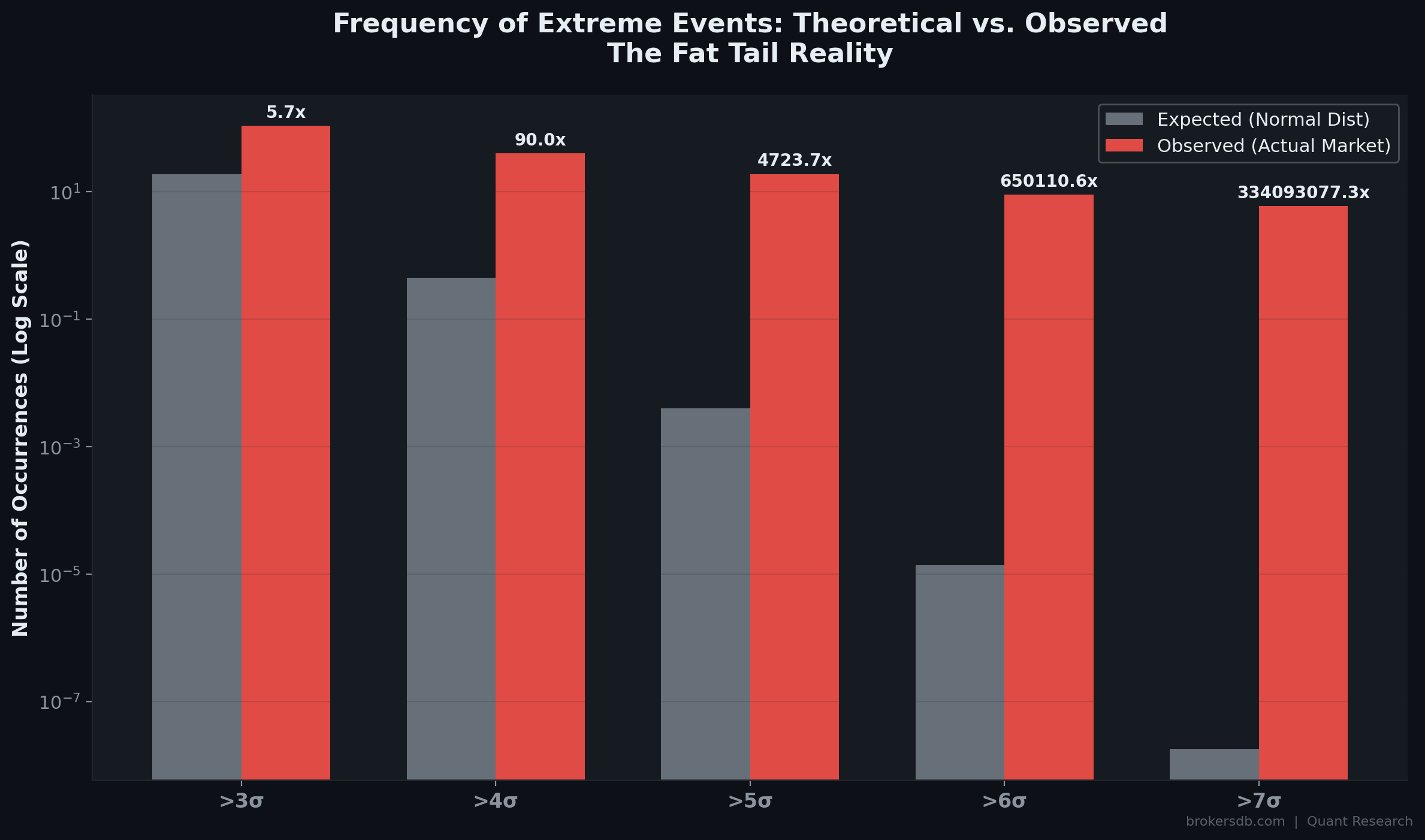
Part XI: Fat Tails and Black Swans — Why Standard Risk Models Fail for Gold
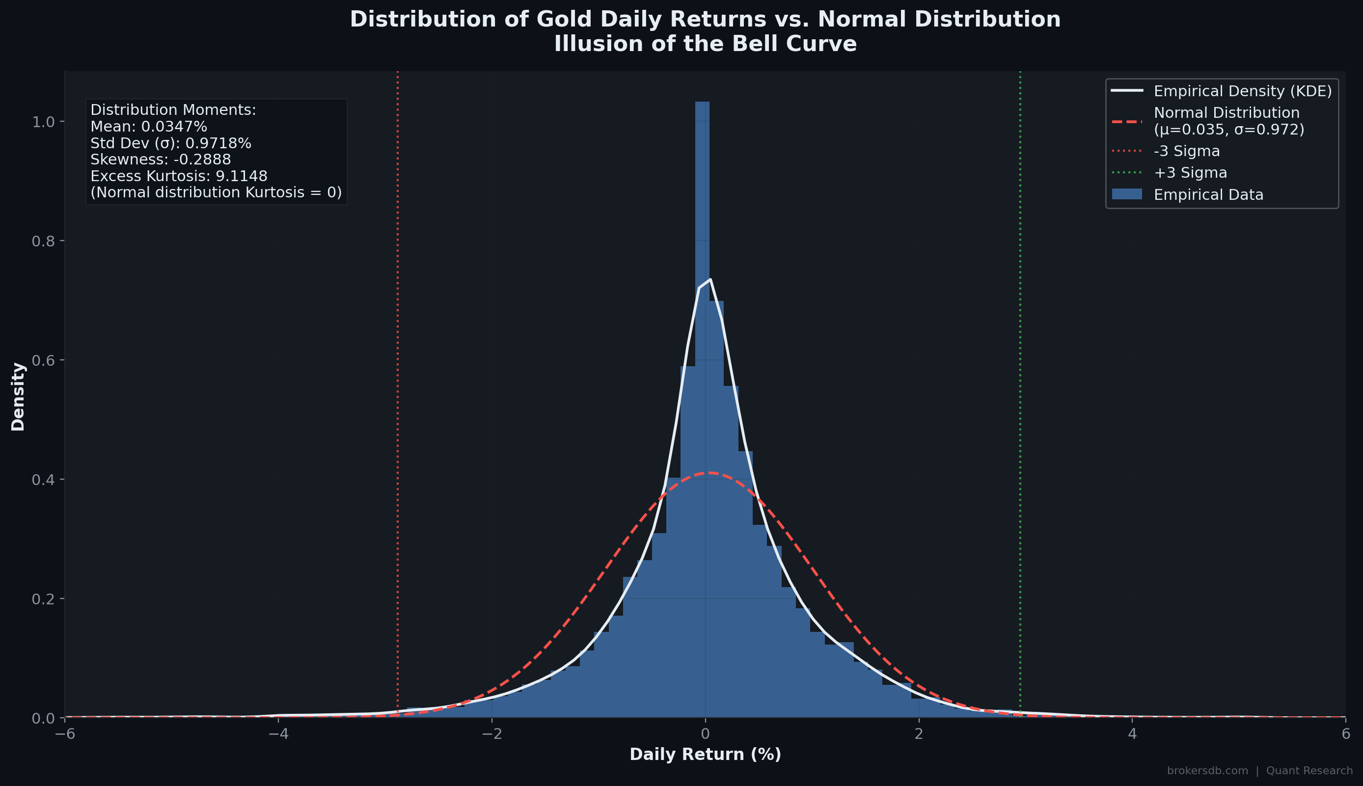
Standard financial risk models — including Value-at-Risk (VaR), most options pricing frameworks, and portfolio optimization algorithms — assume that asset returns follow a normal (Gaussian) distribution. Under this assumption, extreme events (moves of 3, 4, or 5+ standard deviations) are vanishingly rare. Our analysis of 7,016 trading days of gold data demonstrates that this assumption is not merely imprecise for gold — it is catastrophically wrong.
Distribution Characteristics
| Statistical Measure | Value | What It Means |
|---|---|---|
| Daily Standard Deviation (1σ) | 0.97% | Average daily move magnitude |
| Excess Kurtosis | 9.1148 | Massively fat tails (normal distribution = 0) |
| Skewness | -0.2888 | Left tail (crashes) is thicker than right tail (spikes) |
The excess kurtosis of 9.11 is the most important number in this table. A normal distribution has excess kurtosis of exactly 0. A value of 9.11 means that extreme events occur with vastly higher probability than a Gaussian model predicts. The negative skewness (−0.29) adds a directional dimension: large negative moves (crashes) are more frequent and more severe than large positive moves (spikes). Gold's return distribution has fat tails, and the left tail is fatter than the right.
Empirical vs. Theoretical Extreme Events
The following table compares the number of extreme daily moves that a Gaussian model would predict over 7,016 trading days versus the number that actually occurred:
| Threshold | Daily Move Size | Expected (Normal) | Actual | Ratio (Actual/Expected) |
|---|---|---|---|---|
| > 3σ | > 2.9% | 18.9 events | 108 events | 5.7x more frequent |
| > 4σ | > 3.9% | 0.44 events | 40 events | 90x more frequent |
| > 5σ | > 4.9% | ~0.004 events | 19 events | 4,724x more frequent |
| > 6σ | > 5.8% | virtually zero | 9 events | 650,111x more frequent |
| > 7σ | > 6.8% | virtually zero | 6 events | 334,093,077x more frequent |
The numbers are staggering. A >5σ daily move (a price change exceeding 4.9% in a single day) should occur once every 13,000 years according to the Gaussian model. In reality, it happened 19 times in just 22 years. A >7σ event should be virtually impossible on any human timescale — yet gold experienced 6 such events. Standard risk models underestimate the probability of extreme gold moves by factors of thousands to hundreds of millions.
The Five Largest Historical Gold Crashes
| Date | Daily Decline | Price After Close | Context |
|---|---|---|---|
| April 15, 2013 | -9.28% | $1,351.65 | Cyprus bailout, panic selling, margin liquidation |
| October 10, 2008 | -7.57% | $847.49 | Global Financial Crisis — liquidity scramble |
| October 8, 2005 | -7.31% | $440.11 | Sharp correction during early bull market |
| June 13, 2006 | -6.52% | $563.37 | Fed tightening fears, commodity sell-off |
| October 22, 2008 | -6.47% | $722.21 | Second GFC wave, margin call cascade |
The Ultimate Risk Management Lesson: A trading system that operates without a hard stop-loss is mathematically guaranteed to encounter an account-terminating event given a long enough time horizon, due to gold's established fat-tail properties. The probability of a -7% to -9% daily move is not a theoretical curiosity — it is a demonstrated empirical reality that occurs roughly once every 3–5 years. Any leveraged gold position without protective stops is playing Russian roulette with the laws of probability.
Part XII: Intermarket Ratios — Gold/Oil as a Recession Barometer, Gold/Silver as a Trading Signal
Our final research module examines gold's price ratios against two key commodities — crude oil and silver. These ratios have deep roots in macro trading and provide signals that are fundamentally different from the indicator-based analysis in the preceding sections. Rather than testing gold against external economic data, intermarket ratios reveal gold's relative valuation against real-economy commodities, capturing structural shifts in the global economic cycle.
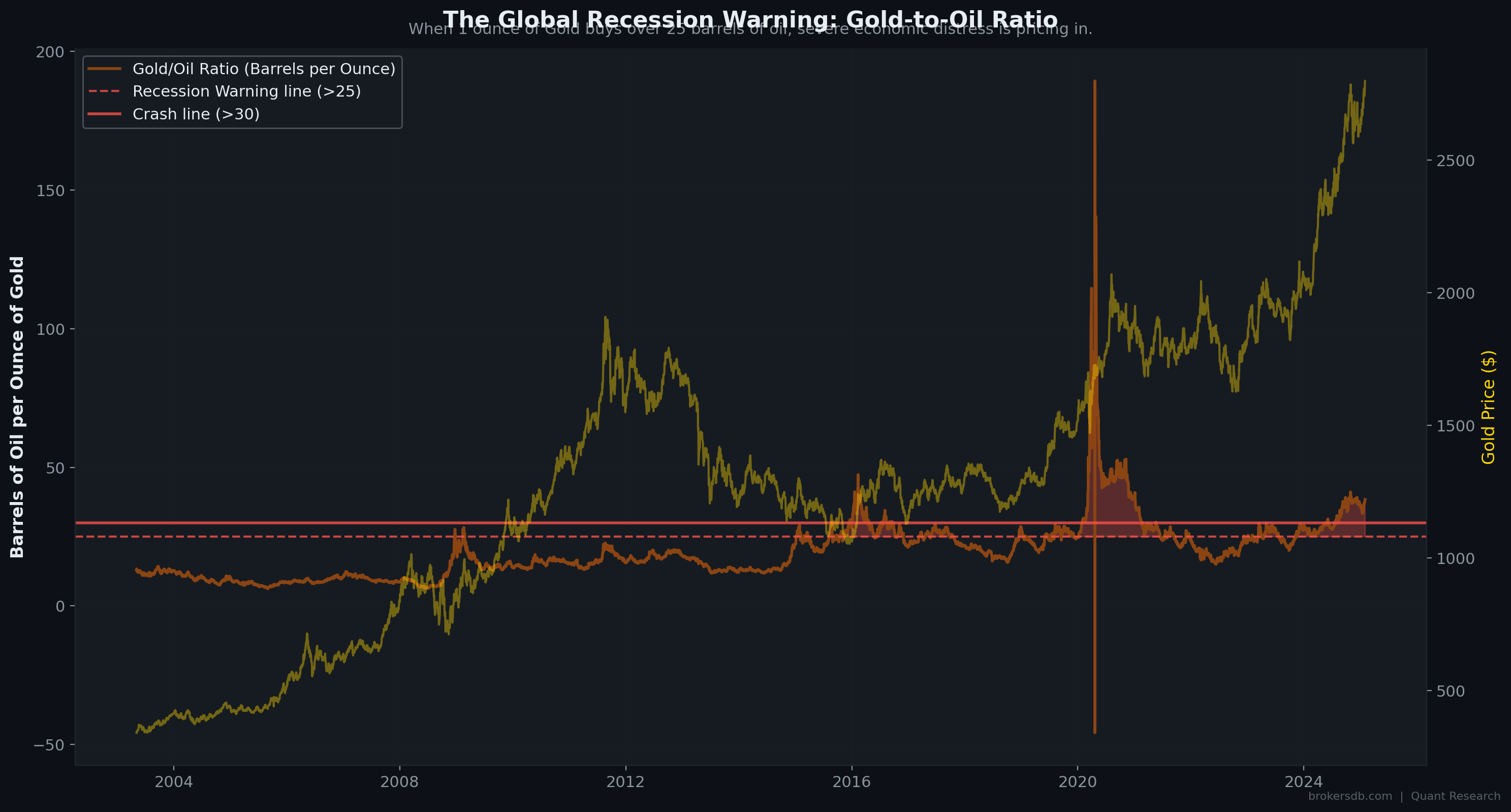
The Gold-to-Oil Ratio: A Global Recession Warning System
The Gold-to-Oil ratio (gold price divided by WTI crude oil price) measures how many barrels of oil one ounce of gold can purchase. Under normal economic conditions, this ratio fluctuates within a relatively stable range. When the ratio spikes — meaning gold is surging relative to oil — it signals that safe-haven demand is overwhelming industrial demand, a hallmark of severe economic contraction.
| Gold/Oil Regime | Trading Days | Share of Sample | Period Context |
|---|---|---|---|
| Normal (< 25 barrels/oz) | 5,289 days | 75.4% | Standard economic conditions |
| Extreme Danger Zone (> 25) | 1,728 days | 24.6% | Economic stress, potential recession |
| Hyper Crash Zone (> 30) | 630 days | 9.0% | 2008 GFC, 2016 Oil Crash, COVID 2020 |
When one ounce of gold buys more than 25 barrels of oil, the global economy is under severe strain. Every major spike above 25 in our dataset coincided with or immediately preceded a significant economic downturn: the 2008 Financial Crisis, the 2015–2016 global growth scare and oil price collapse, and the 2020 pandemic-induced recession. The ratio breached 30 during the most acute phases of each of these crises, reaching an all-time extreme during the COVID crash when oil prices briefly went negative while gold held near $1,700.
The Gold/Oil ratio is not a trading signal for gold itself — it is a macro dashboard metric. A spiking ratio means gold is holding value while industrial demand (proxied by oil) is collapsing. For portfolio managers, this is a signal to hedge or reduce equity exposure. For commodity traders, it identifies periods when oil is likely oversold relative to gold and may offer mean-reversion opportunities.
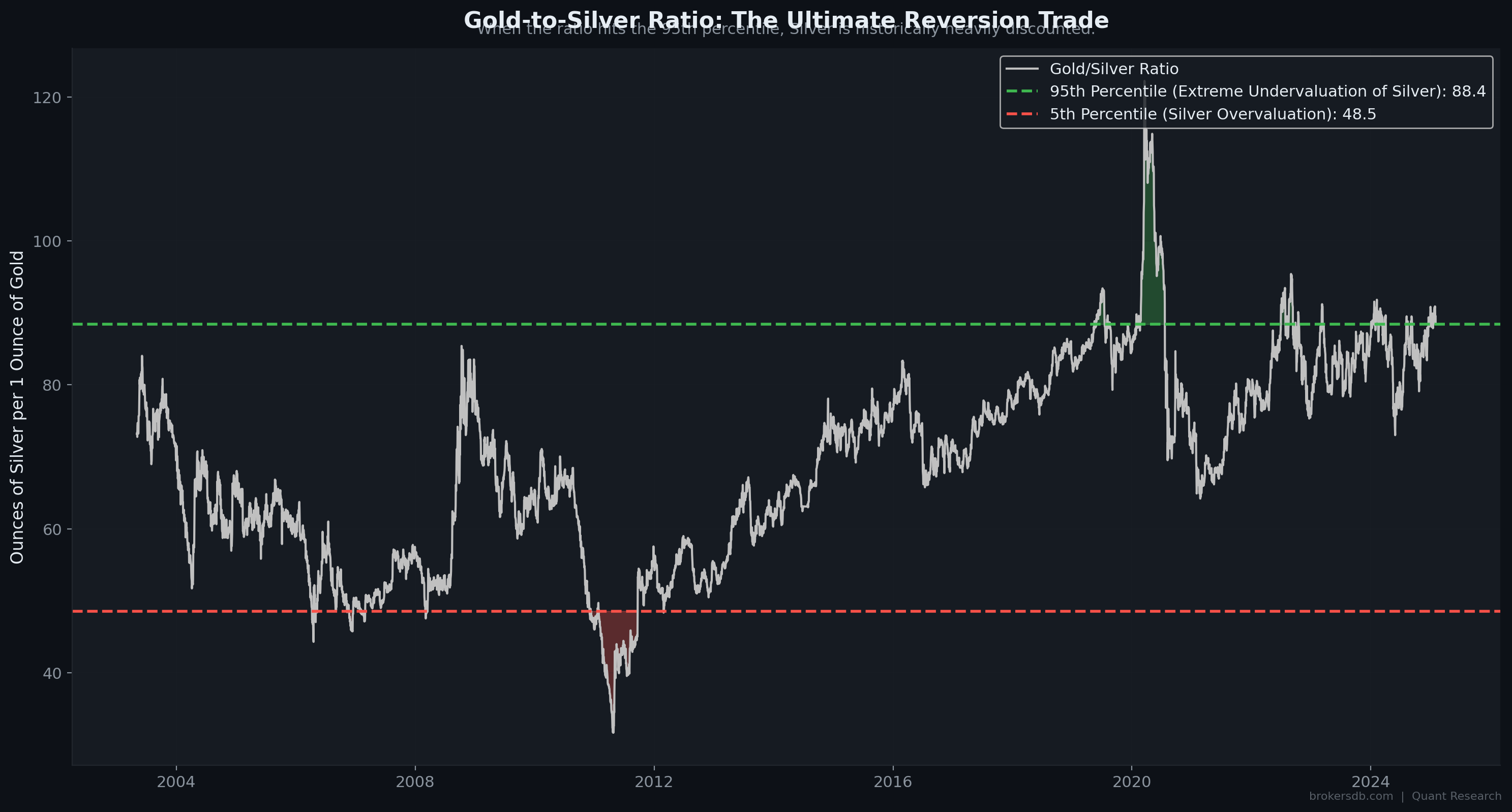
The Gold-to-Silver Ratio: The "Rubber Band" Trade
The Gold-to-Silver ratio (gold price divided by silver price) is one of the oldest intermarket relationships in commodities trading. Silver, with its dual role as a precious metal and an industrial commodity, tends to be more volatile than gold and more sensitive to economic cycles. The ratio oscillates in a mean-reverting pattern that creates actionable trading signals at statistical extremes.
We computed the historical percentile distribution of the Gold/Silver ratio across our full sample:
| Percentile Level | Ratio Value | Signal Interpretation |
|---|---|---|
| 5th Percentile | 48.52 | Silver is expensively priced relative to gold (extreme) |
| 25th Percentile | ~60 | Silver is slightly expensive |
| Median (50th) | ~70 | Neutral — fair value zone |
| 75th Percentile | ~78 | Silver is slightly cheap |
| 95th Percentile | 88.41 | Silver is historically very cheap relative to gold (extreme) |
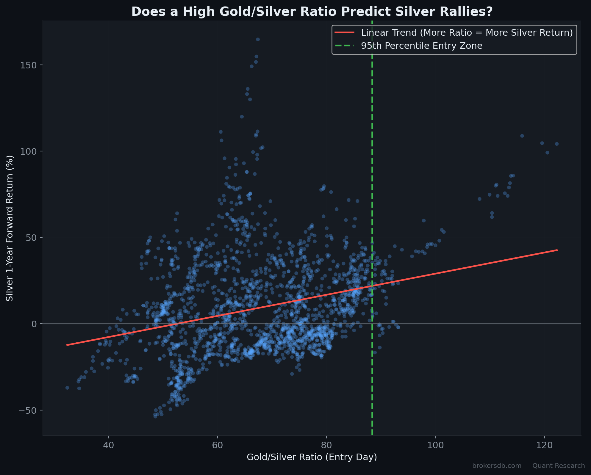
The 95th Percentile Trade: Forward Return Analysis
The most actionable finding in our intermarket analysis is the forward return profile of buying silver when the Gold/Silver ratio exceeds the 95th percentile (above 88.41). At these extreme levels, silver is historically cheap relative to gold, and the "rubber band" effect creates a powerful mean-reversion opportunity:
| Entry Condition | Average 1-Year Forward Silver Return | Win Rate |
|---|---|---|
| Random / Normal Entry | +9.8% | 54.9% |
| Entry at 95th Percentile Ratio (> 88.41) | +36.4% | 79.1% |
Buying silver exclusively when the Gold/Silver ratio exceeds 88.41 has historically delivered an average 1-year forward return of +36.4% with a 79.1% win rate — compared to +9.8% and 54.9% for random entry. The excess return of +26.6% and the 24.2 percentage point win-rate improvement represent one of the strongest conditional trading signals we have identified in this entire study.
The Gold/Silver Ratio Strategy: When the ratio exceeds 88, begin building a silver position. This is a patient, swing-trade strategy with a 12-month horizon. The ratio tends to mean-revert through silver outperformance — silver rises faster than gold during the normalization phase. Most recent entry signal: 2020 COVID crash when the ratio briefly spiked above 120, followed by silver rallying over 130% from its lows.
Conclusion: A Unified Framework for Understanding Gold
Over the course of this 12-part quantitative investigation, we have analyzed gold against 67 macroeconomic indicators, across 7,016 trading days and 260 monthly observations spanning 22 years. The data reveals an asset far more complex and nuanced than either the "gold bug" or the "gold skeptic" narratives suggest. Here we synthesize our findings into a unified analytical framework.
What We Have Proven
- Gold's primary short-term driver is the US Dollar Index (r = −0.45), followed by Treasury yields across the curve. Interest rate dynamics dominate gold's monthly returns.
- Gold IS a long-term inflation hedge (level correlation r = 0.90 with CPI) but NOT a short-term inflation trade (returns correlation r = 0.03). The hedge operates on a roughly 35-month lag.
- The "safe haven" narrative is statistically unsupported for equity market volatility (VIX). Gold's safe-haven property is specific to credit stress (HY spreads > 6%), not equity panic.
- Gold has outperformed money printing by 2.75x over 22 years. The debasement thesis is confirmed: gold's +712% nominal return far exceeded M2's +259% expansion.
- The yield curve inversion is gold's strongest forward predictor, generating +27% excess return over 24 months versus random entry.
- Gold exhibits strong mean-reversion at daily and monthly horizons (Hurst H = 0.48). Extended winning streaks almost always reverse. Extended losing streaks almost always snap back.
- Fat tails are extreme: events that should occur once every 13,000 years (according to Gaussian models) have happened 19 times in 22 years. Standard risk models catastrophically underestimate gold's tail risk.
- January is the best month (+2.99%, 63.6% win rate). The Asia-Pacific session generates virtually all long-term cumulative returns.
- The Gold/Silver ratio above 88.41 is a high-conviction buy signal for silver, with +36.4% average 1-year forward returns and a 79.1% win rate.
The Multi-Timeframe Gold Framework
| Timeframe | Primary Drivers | Best Indicators | Strategy Implication |
|---|---|---|---|
| Intraday | Session flows, positioning | Asian session bias, Friday effect | Session-based timing, day-of-week filters |
| Days to Weeks | NFP, Fed events, mean-reversion | 72-hour NFP rule, Markov streaks | Follow initial event reaction, fade extended streaks |
| Months | Dollar, yields, breakeven inflation | DXY, 5Y Yield, 5Y Breakeven | Three-factor confirmation framework |
| Quarters to Years | Yield curve, monetary regime | 10Y–2Y spread, QE/QT phase | Buy on yield curve inversion, hold for 24 months |
| Decades | Fiscal deterioration, money supply | Debt/GDP, M2, CPI level | Strategic allocation as debasement hedge |
Limitations and Caveats
No quantitative study is without limitations, and intellectual honesty demands that we state ours clearly:
- Sample period: 22 years (2003–2025) covers only one complete economic super-cycle. Gold's behavior during the 1970s inflation, the 1980–2000 bear market, or the pre-Bretton Woods era may differ significantly.
- Regime dependence: Several findings (e.g., yield curve inversion alpha) are based on only 3 distinct episodes. Statistical confidence requires more cycles.
- Survivorship bias: We analyze gold as a single asset. The analysis does not account for the opportunity cost of capital allocated to gold versus equities, bonds, or real estate.
- Data snooping risk: Testing 67 indicators against gold increases the chance of finding spurious correlations. We focus on results with p < 0.01 to mitigate this, but the risk remains.
- Central bank regime change: The 2022–2024 period may represent a structural break in gold pricing due to unprecedented central bank buying from non-Western nations. Historical relationships may evolve.
- Correlation is not causation: All relationships documented here are statistical associations, not mechanistic proofs. External factors not included in our model may be the true causal agents.
Methodology Appendix
| Parameter | Specification |
|---|---|
| Price Data Source | Dukascopy Historical Data Feed (XAUUSD, XAGUSD, WTI Crude) |
| Macro Data Source | FRED API (Federal Reserve Bank of St. Louis) |
| Sample Period | June 2003 – January 2025 |
| Total Monthly Observations | 260 |
| Total Daily Observations | 7,016 |
| Number of Macro Indicators Tested | 67 |
| Correlation Methods | Pearson (linear) + Spearman (rank-based) |
| Statistical Significance Threshold | p < 0.05 (5% level), with emphasis on p < 0.01 (1%) |
| Returns Methodology | Month-over-month percentage change (log returns for stationarity checks) |
| Regime Classification | Quantile-based thresholds applied to indicator levels |
| Hurst Exponent Method | Rescaled Range (R/S) analysis with 250 lags |
| Intermarket Ratios | Simple price ratios (Gold/Oil, Gold/Silver) with percentile-based signal thresholds |
| Visualization | 45 professional-grade charts generated via Python (Matplotlib/Seaborn) |
| Computing Environment | Python 3.11, pandas, numpy, scipy.stats, statsmodels |
Trade Gold with Institutional-Grade Conditions
If this research has sharpened your understanding of what drives gold, the next step is ensuring your broker's trading conditions are precise enough to execute on these insights. Execution quality, spread costs, and platform reliability are not secondary concerns — on a volatile asset like XAUUSD with fat-tail risk and session-specific dynamics, they are critical variables in your overall profitability.
Eightcap
Disclaimer: This research is provided for educational and informational purposes only. It does not constitute investment advice, a recommendation, or a solicitation to buy or sell any financial instrument. Trading gold and other financial instruments involves significant risk of loss. Past performance, including all statistics presented in this study, is not indicative of future results. Always conduct your own research and consider your financial situation before making trading decisions.
Find Your Perfect Broker
Compare hundreds of verified brokers with real server infrastructure data.